• Blog
  • Shop
  • Podcast
  • Resources
  • Archive
  • About
  • Contact
  • Cart
  • Sign In My Account
Menu

The Gentleman Stationer

Vintage Living in the Modern World.
  • Blog
  • Shop
  • Podcast
  • Resources
  • Archive
  • About
  • Contact
  • Cart
  • Sign In My Account

Pen Review: Lamy Safari "Candy" Special Editions

May 14, 2020

Lamy remains one of my favorite all-around stationery brands, particularly for those of us who both use our pens on a daily basis, and appreciate the ability to dabble in the special and limited edition fun from time to time. While Lamy's implementation of its limited edition strategy has been hit and miss over the years, they regularly release some exceptional pens, and the 2020 Safari special editions are no exception.

I love Safari’s with coated clips, especially those that match the pen barrel.

For the second year in a row, Lamy chose to release not one, but three, special edition Safaris. Building on last year's "Pastels,” the company chose "Candy" as this year's theme, and released three pens in shades of purple ("Violet"), turquoise ("Aquamarine"), and yellow ("Mango"). Mango is my favorite, probably because the yellow-orange hue is completely different from anything Lamy has released in the past. While I love the standard yellow Safari, the matte texture and matching clip lend the Mango a warmth the yellow fountain pen lacks.

The three “Candy” Safaris on the left; the three 2019 “Pastel” editions on the right.

What will be curious to see going forward is whether Lamy continues the three-pen releases. Amid growing economic uncertainty for much of the world, will we see companies scale back the number of special and limited editions pens, and maybe even discontinue certain slower-selling items from their standard lines? Lamy tends to make fairly large runs of Safaris, and it's not unusual to see last year's special edition pens on sale a year (or more) later. For example, the 2019 "Pastel" special editions continue to be available for purchase. In the case of Lamy, however, I wouldn't be surprised if things stayed status quo (or if sales even increased) since the company's lower price point pens might actually see an uptick in demand as pen enthusiasts look for less costly ways to indulge in their hobby.

This time around I purchased the matching ballpoints for two of the pens:

The standard Lamy Safari in yellow, on the left, and in Mango (with matching ballpoint) on the right.

Takeaways and Where to Buy

This is a great Lamy Safari release. As a proud member of #teamsafari (as opposed to #teamalstar), I immediately sprung for all three pens to add to my collection of recent special editions. In my opinion, the Mango pen in particular has the potential to be one of the better Safari's Lamy has made.

A combination of high demand and Covid-19 related shipping issues delayed the initial launch of the Candy Safaris, but most Lamy retailers now have them available for purchase. I purchased the pens featured in this review from site sponsor Pen Chalet, which currently has all three fountain pens available, in addition to the rollerball and ballpoint versions. The fountain pen is priced at just under $30, the rollerball $20, and the ballpoint $16. I'm something of a latecomer to the Safari ballpoint, and plan on reviewing that pen separately soon. If you’re interested in picking up one of the Pastel fountain pens, Pen Chalet is currently offering a free converter with purchase.

Disclaimer: This post contains affiliate links. I am a participant in the Pen Chalet affiliate program, which allows me to earn store credit that I can use to acquire items for review on the blog, like the pens featured here.
In Pens Tags Lamy, Pen Review, Safari, Candy Safari, Special Edition, Lamy Special Editions
1 Comment

Pen Review: Vintage Kaweco Sport

May 6, 2020

I've dabbled in vintage pens over the years, but always as a user, and never really as a collector. It's not that I dislike vintage - on the contrary, I love old things, especially practical items that have survived a century or more of heavy use and remain in nearly as good of shape as they were the day they were made. It's more that by the time I arrived in this hobby, I was struck by a feeling that I was too late to comfortably “collect” within my means. Antique store dealers, flea market vendors, and eBay Sellers had all gotten wind of the resurgent interest in fountain pens and prices seemingly went through the roof, even on pens in so-so condition that needed restoration. While I'm always game to start from scratch and learn about a new hobby, including restoring old pens myself, I didn't have much interest in perfecting my skills at $50-150 a pop. While I’ve learned to do basic repairs like changing sacs and Vacumatic diaphragms, that's the limit of my competence, and I would never feel confident enough to work on pen of any significant value.

So, my experience in vintage largely has been limited to purchasing already restored, nicer pieces that are ready for writing, as opposed to the more "completist" approach to collecting that you might see at pen shows. While I mostly own modern pens, I have a few vintage examples, including a couple of Parker Vacumatics, Pilot Myus, some late-model (1980s-1990s) Watermans and Sheaffers, and now my most recent addition, a vintage Kaweco Sport.

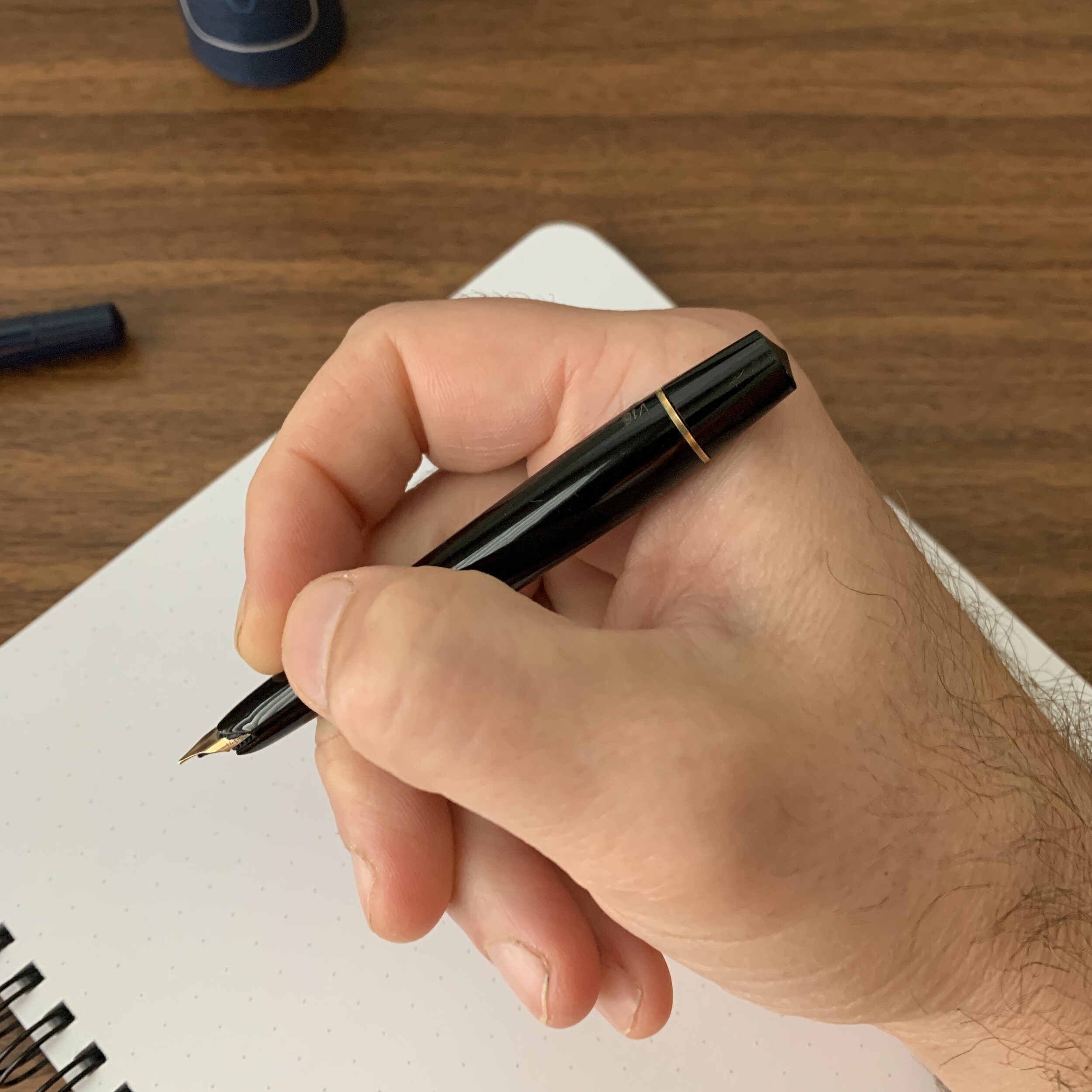
As you can see from the inscription, this is a Kaweco Sport model “V16,” with a “Fine” nib. The facets on this version are more subtle, more akin to the Art Sport than the standard model.

Kaweco Sport: Vintage vs. Modern

Before we dive into a comparison of the vintage Kaweco Sport and the modern pen that you can still purchase today under that name, some brief background on the company itself may be helpful. The original Kaweco (a contraction of Koch, Weber & Co) operated from the late 1800s until the early 1970s, and manufactured several models of pens in addition to the Sport, including the Special, the Elite, and the Dia, all of which you may recognize since the modern company, resurrected in 1994, has released pens under those names. Kaweco actually made multiple versions of the Sport over the years, and the version I own is the last version made in the early 1970s before the original company went out of business. It's part of a commemorative fountain pen and ballpoint set made for the 1972 Munich Olympics, complete with a leather case and medallion.

The modern Kaweco Sport is generally a larger pen than the vintage model that I own. It's longer and more substantial, and from what I can tell based on studying the pictures in Andy Lambrou's Fountain Pens of the World, was based on a 1930s version of the Sport with more pronounced facets on the cap. The vintage Sport feels quite small in comparison, though when extended and posted for writing it's actually a touch longer than the modern Sport.

View fullsize Vintage Kaweco Sport In Hand
View fullsize Vintage Kaweco Sport Posted

What else is different? While the modern Kaweco Sport has developed a well-deserved reputation as an inexpensive pocket pen with a steel nib perfect for both beginning fountain pen enthusiasts and experienced users, the vintage Sport featured a 14k gold nib and a piston filling system. The weight of the vintage pen shocked me a bit - despite the integrated piston, it's only slightly heavier than the modern pen. I really wish Kaweco would reissue this classic design, even though the cost of the piston (and the gold nib, if they decided to go that route) would likely require a significant price increase, which I suspect is the main reason it hasn't happened yet.

The nib on this vintage Kaweco Sport writes well, and leaves a moderately wet line, though I’d call it more of a fine-medium than a true fine. Check out that ink window!

I love how Kaweco retained the same script on its modern Sport series. The ballpoint has aged better than the fountain pen, probably due to the fountain pen seeing heavier use.

The finial/medallion on top of the pen is another vintage design element that Kaweco retained on the modern Sport.

Final Thoughts and Where to Buy

I love this little pen. Despite being nearly 50 years old, it feels as sturdy and well-made as a modern Kaweco, though I likely won't tempt fate by using it for true pocket carry. And while I have no plans to dive back into vintage pen collecting, it's tempting to pick up a few more examples of vintage Kawecos, especially if the pens remain as functional as this one. The Munich Olympics connection also makes for a cool piece of history to own.

I purchased this vintage Kaweco pen set from Maria, who sells through her Etsy store MaryMagicBox, which I discovered thanks to a tip from a member of our local Nashville-area pen group. Maria stocks a wide range of restored vintage pens, along with some gently used modern pens, with a focus on German brands such as Montblanc, Pelikan, and Kaweco, along with other lesser known marks including Osmia (later acquired by Faber-Castell). Though vintage Kaweco Sports are less common, they do come up from time to time in Maria’s shop, and she has other models of Kaweco pens available for purchase. If I do get the itch to acquire more vintage, I wouldn’t hesitate to order from Maria again.

Disclaimer: This post contains Etsy affiliate links.

Though this particular refill still works, could someone do me a solid and let me know whether you can still purchase these today? Or maybe hacking another refill (D1?) to get it to work in a vintage Sport ballpoint?

In Pens Tags Kaweco Sport, Vintage Kaweco Sport, Kaweco Sport Munich Olympics
7 Comments

Initial Thoughts: The Platinum Curidas

April 30, 2020

With an emergency court proceeding blowing up this week (which means lots of writing!) my two new Platinum Curidas fountain pens received the proverbial baptism by fire. I’m happy to offer you my initial impressions. The general takeaway: The Curidas is a solid retractable fountain pen that feels well-built and is fun to use, but at the end of the day it’s definitely over-engineered and targeted to the pen geek, and certain design choices will almost certainly keep Platinum’s latest release from becoming something that most people are going to want to use every day. I’ll break down my reactions into three categories.

First, The Positives:

  • Writing Comfort. Based on how I hold the pen, I easily find the Curidas more comfortable than it’s main (or only) competitor, the Pilot Vanishing Point. Whereas the clip on the V.P. runs all the way down to the nib and basically forces you to wrap your fingers around it, Platinum opted to leave additional space for those with a more traditional grip to hold the pen naturally without adjusting for the “bumps” created by a clip or the plastic nub on the bottom of the pen, which also serves as a roll-stop. This is hard to explain, so take a look at the pictures below. If you use a similar grip, you’ll probably be fine. If your grip is different, YMMV.

  • Build Quality. Platinum makes excellent pens, and the Curidas is no exception. To keep the price below $100, Platinum went with mostly plastic construction, but the pen feels sturdy - not at all inexpensive or flimsy. While I have my own thoughts on the design of the knock (discussed further below), the mechanism deploys and retracts the nib smoothly, and it’s admirable that Platinum managed to keep the price down on a pen with so many moving pieces, all of which must have been custom designed.

  • Colors and Transparent Materials. I love Platinum’s 3776 demonstrator pens. The colors they use always seem to pop, and the plastic never looks cheap. The Curidas is no exception. I opted for the “Gran Red” and “Urban Green” pens, both of which look great. I normally prefer red pens, but the Urban Green is particularly stunning in person.

View fullsize Platinum Curidas with Nib Extended
View fullsize Platinum Curidas Grip Close-up

The Negatives:

  • Convoluted and Difficult Assembly. In order to refill the Curidas, you have to completely disassemble the pen, which is no small undertaking. As show in the photo gallery below, this entails removing the back half of the barrel (not a big deal); removing the spring-loaded nib assembly (a little more complicated, since Platinum uses a tongue-and-groove system to secure it); and removing yet another metal piece covering the converter and/or cartridge. It’s a remarkable feat of design and engineering, and it allows you to use the standard Platinum converter, but it creates a lot more complications than the average fountain pen user is going to want to deal with.

  • Awkward Sizing. With the knock depressed and the nib deployed for writing, the Curidas fits my hand perfectly. The pen is properly weighted and well-balanced for longer writing sessions. The issue I have is with the size of the pen with the nib retracted. I have average-sized hands, and I really have to stretch to use the knock. Plus, it just makes the pen look awkward. Couldn’t they have reduced the length by a centimeter or so?

View fullsize Platinum Curidas Disassembly, Stage 1
View fullsize Platinum Curidas Disassembly, Stage 2
View fullsize Platinum Curidas Disassembly, Stage 3

With the knock extended, the Curidas is an extremely long, and even awkward pen, both in terms of looks and feel. I don’t find the mechanism all that comfortable to use. It’s a stretch to get my thumb over the end.

The So-So:

  • The Nib. The medium stainless steel nib on the green pen is exceptional, and the fine nib was not. So, overall, a mixed bag. Let’s start with the good; the medium wrote a relatively wide, wet line, that others have accurately described as stubbish. For a stock steel medium nib - typically a very boring option - my green Curidas offers a spectacular writing experience, as long as you get a good one. Now for the bad: the fine nib on my red pen was extremely dry and scratchy out of the box. Curiously, I had the same experience with my Platinum 3776 Ultra-Extra Fine (UEF) nib. Platinum generally has an excellent reputation when it comes to nibs, especially fine and extra-fines, and I’m surprised I’ve had this happen to me on a pen with as much pre-launch hype as the Curidas.

View fullsize Platinum Curidas Medium Nib
View fullsize Platinum Curidas Fine Nib

Takeaways and Where to Buy

Obviously, I haven’t had the Curidas in my rotation for very long, but I did put Platinum’s latest release through the paces during a particularly strenuous week of work that involved a lot of writing. Retractable nib fountain pens are generally going to have a very specialized target audience - true pen geeks - and as long as Platinum realizes that casual users may be turned off by the pen’s complexity, I can appreciate Platinum’s efforts to grow the category. That said, the knock design bothers me a lot, both functionally and aesthetically, and I plan to withhold final judgment until I get a better sense of how much I’ll actually use this pen on a day-to-day basis, and whether I hear additional reports of spotty nib quality.

I acquired the Platinum Curidas fountain pens featured in this review from site sponsor Pen Chalet, which still has several colors in stock priced at $80. Platinum does not allow discounting on this pen. Other Platinum retailers (such as site sponsors Vanness Pens, Goldspot, and Appelboom), also carry the Curidas, but availability will likely be uneven given delays in distribution and shipping in light of current events.

Disclaimer: This post contains affiliate links. I am a participant in the Pen Chalet affiliate program, which allows me to earn store credit that I can use to acquire items for review on the blog, like the pens featured here.

In Pens Tags First Impressions, Platinum, Platinum Curidas, Retractable Fountain Pens, Pen Review
1 Comment

Pen Review: Leonardo Furore with Rose Gold Trim

March 15, 2020

Today’s review looks at the “Furore” fountain pen from Leonardo Officina Italiana, the penmakers based in Naples, Italy who have exploded in popularity over the past two years. Their Momento Zero and Momento Zero Grande are some of my favorite fountain pens on the market right now, and the “Furore” is their first attempt at a new shape that, to date, has received less attention than the Momento Zero but presents an equally excellent value proposition. 

Back to Basics: Pen Design from the 1920s Remains Relevant Today

For its second model, Leonardo chose another vintage-inspired design: a classic streamlined shape that borrows from pens like the Sheaffer Balance, an icon of 1920s-1930s penmaking. Although the larger size and bright acrylic material give this away as a modern pen, the shape and design elements such as the double cap band and roller clip will have the Furore looking right at home in your pen case next to your vintage pieces. Other things I immediately noticed upon unboxing my Furore are that (1) the ends are far less pronounced and pointy than Leonardo’s stock images make them appear, and (2) the pen itself is not long and skinny, something that also concerned me from images I had seen online. Sadly, while I’ve had opportunities to glance at the Furore on tables at pen shows, I never took the time to do a thorough overview until now.

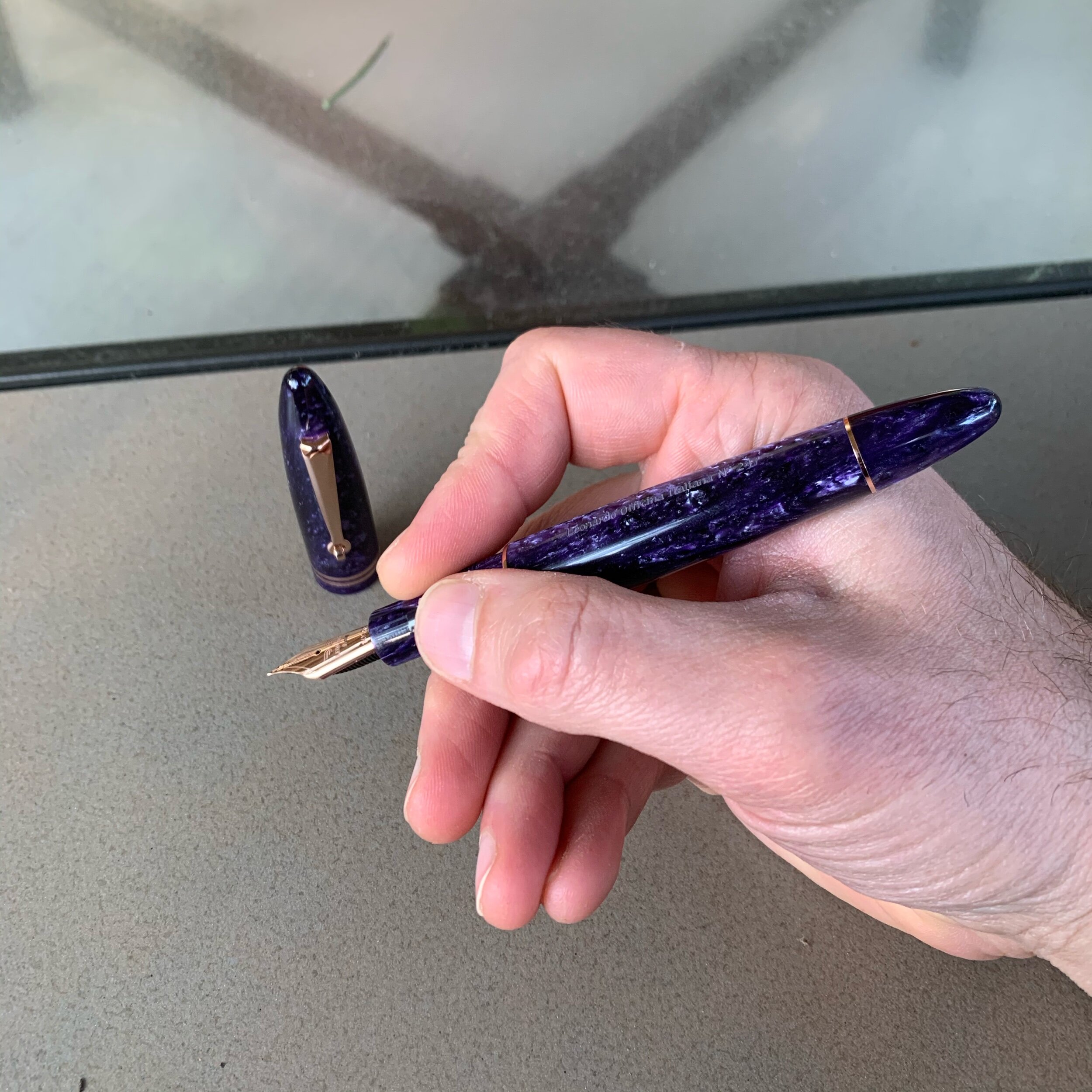
I’m not sure whether the “Deep Purple” Furore is a limited edition, but my pen is numbered.

Where the Momento Zero incorporates a wide range of acrylics and other materials in patterns reminiscent of vintage celluloid, the Furore line comes in solid colors inspired by landscapes along the Amalfi Coast. Leonardo has chosen colors they characterize as “bright and strong,” and that’s a good description of the lineup, which includes: “Arancio” (orange), “Blue Emerald” (turquoise), “Blue Emerald” (a darker ocean blue), “Bronze” (pearlescent brown), “Deep Purple” (pearlescent purple, pictured here), “Grey Vulcano” (pearlescent grey), “Red Passion” (pearlescent red), “White Salt” (pearlescent white), and “Yellow Sun” (pearlescent yellow). Most colors are available with either gold or rhodium trim, and the Deep Purple model shown here is offered with rose gold. Since I’m trying to reduce the total number of pens that I own at any given time, my goal is to limit myself to a single Furore, but as with the Momento Zero, it’s going to be hard. 

View fullsize Leonardo Furore Unposted
View fullsize Leonardo Furore Posted

As I’ve said before about many other vintage-inspired fountain pen designs, there’s a good reason these particular shapes have withstood the test of time and continue to appear on pens nearly a century later. Both the Momento Zero and the Furore are insanely comfortable pens to use, posted or unposted. I love the fact that the caps post deeply, allowing Leonardo to make a larger pen that you can use unposted, but that we “posters” can still use in our preferred way without adding excess length or throwing off the balance. 

The Leonardo Furore uses the same filling system as the Momento Zero: a threaded converter that can be used in the traditional manner or “piston style” by removing the blind cap.

Bored with the Standard Choice Between Gold and Rhodium? Give Rose Gold A Try

Speaking frankly, I’ve been a little bored with my fountain pens. Over the past few years, I’ve fallen into a rut where I’ve accumulated a lot of pens that may not appear identical, but definitely share a common design theme. There’s nothing wrong with that - it tends to happen in collecting, especially to those who have been in a hobby for a long time and learned what they like. But the line between developing strong preferences and locking yourself into a “rut” where you stop exploring new things is fairly thin. For the longest time, I resisted picking up a rose gold pen. Now I own two. 

I knew little to nothing about rose gold as a material until recently. Rose gold derives its reddish hue from mixing pure gold with a copper and/or silver alloy, and the specific reddish tone can vary depending on the proportions used in the mix. Some rose gold trim appears almost pink, while others take on darker, more coppery hues. The rose gold used by Leonardo on my Furore leans toward the darker end of the spectrum, and accentuates the Deep Purple acrylic quite well.

Even the converter/“piston knob” is plated in the rose gold trim. I’ve previously remarked on Leonardo’s attention to detail, which continues with this pen.

Takeaways and Where to Buy

I regret waiting so long to give the Leonardo Furore an extended tryout, and purple pen fans will want to give this particular model serious consideration. For whatever reason, my perception of the Furore ended up skewed by the stock images available online, which made the Furore seem like a narrower pen than it actually is. The streamlined design turned out to be extremely comfortable posted or unposted. Most notable about this purchase for me is the fact that this Furore represents the first pen with rose gold trim in my collection, I love it, and it prompted the purchase of another rose gold pen, which you all will be seeing soon. Could rose gold be a new “thing” for me? We’ll see.

While certainly not “cheap,” Leonardo pens are notable for their relatively accessible price points: you can purchase one of their designs for as little as $160 in a standard material, which will net you an exceptional pen, and you can spend more if you desire a gold nib or aesthetic upgrades such as a rare material like Italian celluloid. I purchased this pen from site sponsor Appelboom, who carries the entire Leonardo Officina Italiana lineup, including not only the Furore but the acclaimed Momento Zero and the newly released Messenger. With a steel nib, the Furore runs 147 Euros / $163 USD, depending on the exchange rate. If you opt to upgrade to the 14k gold nib, the price jumps to 328 Euros / $365 USD. Here, the 14k nib in rose gold absolutely kills it in terms of overall finish and appearance. Personally, I find Bock gold nibs much more consistent in terms of overall performance than the standard steel. While Leonardo tunes their steel nibs, and the ones in my collection are all nice writers, I prefer the feel of the gold. 

Finally, this rose gold Furore is special for another reason: it’s the first pen chose for review by my Patreon backers. One benefit I offer to my Patreon subscribers (at the “Bespoke” and “Special Edition” tiers) is the ability to vote on reviews. The Leonardo Furore won the first poll, and I have additional content in the works based on subscriber input. Many thanks to the generous Patreon supporters who made this review possible.

Disclaimer: This post contains links to paid sponsors and affiliates. I purchased the pen featured in this review from site sponsor Appelboom, using affiliate credit generated through the Appelboom affiliate program, which is one way I support the blog.

In Pens Tags Fountain Pen, Pen Review, Leonardo Officina Italiana
Comment

Pen Review: Matthew C. Martin OG1 Fountain Pen

March 8, 2020

Though I’ve attended two pen shows, I’ve purchased very few pens in 2020, including none in Baltimore. One of my stated goals for the New Year was to continue to focus on refining my collection into a more personally meaningful set of pens and to own less stuff overall. I’ve mostly managed to stick to the “plan”, but Philly got me at both the Matthew C. Martin Custom Pens and Schon DSGN tables. For today’s review, I’m going to take an in-depth look at a pen that’s become a constant travel companion over the past six weeks: the Matthew C. Martin/”MCM Pens” Original, or as Matthew calls it, the “OG1”. 

Machined metal fountain pens and I have had an inconsistent relationship over the years. I’ve owned metal pens from Karas Kustoms and Tactile Turn, as well as various Kickstarter pens, but with the sole exception of the second iteration of the Tactile Turn Gist (which is excellent), none have stuck in my rotation for a meaningful amount of time. The primary reason is weight: It’s extremely difficult to design a machined fountain pen that most people can comfortably use for long periods of time (i.e., why many people turn to fountain pens in the first place). Since nearly all of these pens feature metal grip sections, the added weight from the barrel makes the pen even more awkward to hold by increasing the probability of the pen sliding around in a sweaty hand, which will be working harder to keep the nib under control. 

Capped, the MCM Pens OG1 is roughly the same size as a Lamy 2000, and perhaps slightly more compact.

Machinist and penmaker Matthew Martin has, in my opinion, done the best job of controlling for these factors using both smaller designs and what he refers to as “weight reduction machining.” In other words, he thins the walls of the barrel and cap, resulting in pens that are exceptionally light and comfortable to use even when made from heavy metals such as copper and brass. Combining this technique with other design choices, such as his use of the grooves in the pen pictured here, reduces the weight even further. MCM titanium and zirconium pens end up being so light that it’s fair to describe them as “featherweight.” 

Build Quality 

The MCM pens OG1 is easily the best-made machined metal pen I have ever used. Period. As I noted above, Matthew’s combination of excellent design and weight-reduction techniques creates a pen that is just as, if not more, comfortable to use than many acrylic pens, and I’ve never been able to say that before. But it’s not just about utility. The artistry involved in machining the grooves in the barrel and cap makes these pens instant conversation pieces, and don’t say I didn’t warn you that it’s the type of pen that will go “walking off” an office desk. 

If you carry a grooved pen around in a pen case or a bag, it will eventually collect lint and dust. I recommend using a can of compressed air to clean it out periodically.

The pen I purchased is made from a combination of zirconium and blue anodized titanium. Matthew also machines his own clips, and recently released pens featuring exotic metals more commonly used in the knife industry, such as Mokume-gane (Japanese-style “wood grain metal).  Matthew has made knives as well, and his father is a well-known knifemaker. 

Despite its high price, zirconium pens are among my favorite. The darker tone of the zirconium pairs well with anodized materials.

Nib and Overall Writing Experience

Matthew wisely chose to use standard JoWo No. 6 nibs, meaning that those of us with larger collections can swap in favorites like the Franklin-Christoph EF SIG pictured in this review. The standard medium nib that came with this pen, however, was also well-tuned and has a place in my stash of good JoWo writers. 

Where this pen shines is comfort. In terms of length, the MCM OG1 pushes the boundaries of how short a pen I can reasonably use. The OG1 doesn’t post, and measures 4.75 inches uncapped. While the added weight of a metal pen makes the shorter body more usable for me as a daily writer, I can’t say the lack of postability is a total non-issue. For pure EDC, I’d prefer to not have to worry about keeping track of the cap, or having it roll away while writing, but that’s a design choice that I’m willing to overlook here for the unique grooved design. For my next MCM pen, however, I will likely opt for a model with a milled clip, which can act as a roll-stopper.

I recognize that the grooved design I chose won’t be comfortable for many people. Since I don’t have sensitive hands, the grooves on the barrel and ridges on the grip section don’t bother me, but others might prefer a smooth barrel and/or a different grip texture, both of which are available.

Takeaways and Where to Buy  

Since I picked up this pen at the Philadelphia Pen Show in January, it hasn’t left my pen case, and has barely left my hand. Matthew Martin represents the best of the new, emerging generation of penmakers, and his work shows a combination of creativity and technical expertise that you don’t see often, especially with someone working out of a small shop. Visiting his table has been a highlight of the past few pen shows - each time he shows up with something that pushes the envelope even further. 

As you might expect given the choice of materials, advanced machining techniques, and overall level of craftsmanship, MCM pens are not inexpensive. The blue-anodized titanium and zirconium pen featured in this review cost me $575. Currently, the least expensive model starts at $275 (for a bronze or copper pen), with pens priced as high as $1,750 for a pen made from layered zirconium and titanium with a milled zirconium clip. Matthew sells his pens directly on his website, and he mentioned in Philadelphia that he intends to increase the number of U.S. pen shows he attends as long as he can keep up inventory. Many thanks to Matthew for taking the time in Philly (both at the table, and in the evening at Ian Schon’s open house) to offer insight into his machining techniques and design theory.

Disclaimer: I purchased the pen featured in this review with my own funds, for my own personal collection.   

In Pens Tags MCM Pens, Matthew C. Martin, Machined Pens, Fountain Pen, Pen Review
Comment
← Newer Posts Older Posts →
Store Hours and Events
Shop T.G.S. Online
Updated 2026 "Best Pens" Guide
No results found
On The Paper Trail: Live In Nashville Event Tickets Now Available!
TGS_25 Roterfaden Restock Notification
Hierarchies of Fountain Pen Friendly Paper

Join Our Patreon!
Subscribe to the TGS E-mail List

Featured Posts

Featured
10-Fountain-Pens-Favorite-Inks
August 22, 2026
Three Keeper Inks: Choosing Inks for 10 Fountain Pens
August 22, 2026
Read more →
August 22, 2026
Everyday-Stationery-Bags
July 25, 2026
What's the Best Everyday Stationery Bag? My Own Considerations and 5 Options for Pen Show Season
July 25, 2026
Read more →
July 25, 2026
Graphilo-Kobeha-Paper.jpg
July 11, 2026
Paper Review: Graphilo by Kobeha
July 11, 2026
Read more →
July 11, 2026
The Gentleman Stationer RSS

View Cart

© Digital Divide Media, LLC, 2014-present.

All content is the exclusive property of Digital Divide Media, LLC, d/b/a The Gentleman Stationer, including “The Gentleman Stationer” website and trademark, and should not be reproduced without express written permission.  All rights reserved.

All content containing paid advertising, affiliate links, or sponsored content will be plainly disclosed by a disclaimer when/if featured.

Contact Information

Website Terms and Conditions

Store Shipping Policy and Return Policy

Privacy Policy and Cookie Policy

Accessibility Statement

Powered by Squarespace