• Blog
  • Shop
  • Podcast
  • Resources
  • Archive
  • About
  • Contact
  • Cart
  • Sign In My Account
Menu

The Gentleman Stationer

Vintage Living in the Modern World.
  • Blog
  • Shop
  • Podcast
  • Resources
  • Archive
  • About
  • Contact
  • Cart
  • Sign In My Account

Pen Review: Morning Glory Mach 3 Liquid Ink Rollerball

September 2, 2017

I enjoy the fine, precise line that a needle-tip pen offers, especially when I'm annotating legal documents at work and (1) need to write very small or (2) need to write on crappy paper. Sometimes both. I've previously preferred the Pilot Hi-Tec-C, which is my go-to needle-tip gel pen, but that pen can be finicky and tends to skip and hard-start more than I like. Apart from my Coleto multi pens, I find myself using the Hi-Tec-C less and less. After one particularly frustrating experience in which I had to throw out an orange .4mm Hi-Tec-C that, for whatever reason, I simply couldn't get to write, I took a flier and ordered a few of the Morning Glory .38mm liquid ink rollerballs in blue and orange. Now I might have found a great all-around needle-tip pen that works for me. 

The textured grip of the Morning Glory Mach 3 prevents the pen from becoming too slippery. 

Before reading this review of the Mach 3 over at The Pen Addict several years ago, I'd never heard of the brand "Morning Glory." The pens have received positive reviews, but liquid ink rollerballs generally aren't my thing. They can feather and bleed just as badly as fountain pens (and sometimes worse) on "office quality" paper once you get above the .5mm tip size. Would a .38mm tip be the sweet spot for this type of pen? 

So far, yes. The Mach 3 may become one of my standard "office pens," and it will certainly make its way into my "highly recommended" category. I've test driven the Morning Glory for the past two weeks, and I've reached for this pen nearly every time over the Uniball Vision Elite, which simply can't write the extremely fine line that I often need.  And while the Morning Glory may not be quite as smooth or vibrant as the Hi-Tec-C, I've found it more reliable. (No skipping!) 

Takeaways and Where to Buy

If you're a fan of needle-tip pens, or wish that your liquid-ink Vision Elite or Pilot Precise V5 wrote a finer line, then you should check out the Morning Glory Mach 3. I'm not aware of another liquid ink pen that comes in a .38mm tip size. Though it's relatively inexpensive, the Mach 3 can be hard to find. Jet Pens will sell you single pens in more uncommon colors (like the orange one shown here) for around $2.50 per pen. If you're a fan of the more conservative blue, black, or red (and Morning Glory's blue is great), you can purchase packs of a dozen at a much lower cost via Amazon. 

Disclaimer: I purchased the pens featured in this review with my own funds, for my own use.

In Pens Tags Rollerball, Disposable Pens, Morning Glory, Liquid Ink, Mach 3
Comment

Pen Review: The New Wahl-Eversharp Skyline Technik

August 26, 2017

There are good ways and bad ways to relaunch vintage pen brands. We all know the bad, but I don't see a lot written about brand revitalizations done correctly. In 2013, Syd Saperstein did just that - acquiring the rights to and manufacturing pens under the name of a vintage brand that he had collected and loved for years: Wahl-Eversharp. I won't go into a full history of the brand here, but Wahl-Eversharp was a major American pen brand until the advent of the ballpoint in the 1950s, at which point it failed to keep up, fell by the wayside, and ultimately disappeared.

Potentially the most impressive pen packaging on the market, though I don't believe the lacquered boxes still feature the wood inlay. 

The new Wahl-Eversharp chose to launch with the Skyline collection, an updated version of the vintage pen of that same name. For those unfamiliar with vintage pens, the Eversharp Skyline features iconic 1940s design, taking inspiration from city skyscrapers, hence the name. Skylines are great little pens - I've restored several myself - though as the years go by the plastic on these pens becomes brittle, and many people dislike having to deal with the often temperamental sac and lever-filling system on the original.

View fullsize Wahl-Eversharp Skyline Posted
View fullsize Wahl-Eversharp Skyline Unposted

Here, the new company has taken the Skyline's original design and modernized it. They retained the oversized cap and slim, tapered barrel, but have utilized modern materials such as anodized aluminum and transparent acrylic (though they also have a gorgeous series of celluloid pens as well). The pens use a cartridge-converter filling system, and the barrel accepts the long Waterman-style ink cartridge. 

Unfortunately the blue Skyline Technik is no longer available in rhodium trim, only gold. The rhodium pairs better with the blue, in my opinion. 

Ceramic Coated Nibs and Optimized Feeds

The new Wahl-Eversharp nibs have drawn much of the attention around the brand. The nibs are stainless steel, but they've been treated with a ceramic coating that makes the nib not only super smooth but gives it some bounce. The company describes these nibs as "semi-flex," and claims that they writes from a fine to medium line. I'm not a flex-pen aficionado in any sense, but I'd caution against expecting a true "flex" experience - if that's what you're looking for, save up for a Decoband. Regardless, the nib on this Skyline has some nice variation, and I would describe the fine-to-medium range as accurate. 

Wahl-Eversharp also pairs these nibs with a specialized "magic" feed. I'm not exactly sure what exactly the company has done to the feed to optimize the ink flow, but the result is impressive - I experienced no dry writing or railroading, and the nib wrote a pleasantly wet line throughout my test-drive of this pen.  

Not the best writing sample, but this will give you some idea of the bounciness of the nib. The nib is NOT a dry writer - this particular ink looked a bit washed-out when it dried. 

Overall Takeaways and Where to Buy

Pros:

  • If you're a fan of the original Eversharp Skyline's design, but don't want to mess around with often-temperamental vintage lever-fillers, you now have a cartridge-converter option. 
  • Sturdy construction
  • Smooth stainless steel nib that's on the softer side - not flexible, but most should be able to coax out some line variation 
  • Gorgeous presentation in a lacquered box

Cons:

  • The slim barrel might make this pen too small for some to use comfortably over longer writing sessions.
  • This particular pen (the Skyline Technik) sits at a high price point, though other versions of the Skyline fall into the $160 range.

I can absolutely appreciate the new Wahl-Eversharp Skyline: it's more than a tribute pen or an homage to the vintage brand - it's a full-on modernization of an iconic piece of 20th century design, which arguably retains the best aspects of the original and improves upon its faults. It's a well-made pen that writes well, especially if you like a little bit of spring in the nib. 

At the same time, I probably won't be acquiring one of these pens, for the same reason that I'm not a big fan of the original Skyline - the look of the oversized cap paired with the tapered barrel just doesn't do it for me, and I find the pen a touch small for my hand, especially since this nib is one that I'd want to use for longer writing sessions. Now, if Wahl-Eversharp ever makes a normal-size version of their oversized Decoband, or brings back the faceted Doric from the 1930s, then I'm all in. (I've heard rumors on the pen show circuit that both are in the works, but it might just be wishful thinking on the part of Wahl-Eversharp enthusiasts.)   

You can purchase the Wahl-Eversharp Skyline directly from the company itself, or through retailers nationwide. Anderson Pens currently offers most of the Wahl-Eversharp product lines, including the Skyline Technik Collection featured here. Price-wise, the various Skyline models range widely from $159 for the "Skyliner 50 Collection", to $280 for the aluminum Technik Collection, to $289 for the "Empire Celluloid Collection". There are even more expensive special/limited edition models, some of which have crazy cool packaging, but those are beyond the scope of this review.         

Disclaimer: Many thanks to Anderson Pens for making this review possible. Brian Anderson loaned me this pen from his personal collection. I was not otherwise compensated for this review. 

In Pens Tags New Wahl-Eversharp, Wahl-Eversharp Skyline, Pen Review
1 Comment

Pen Review: ystudio Portable Fountain Pens

August 19, 2017

I won't lie - at times I've started to get a bit bored with the pen scene over the past year. While there certainly have been bursts of inspiration, occasionally I want to see something more than just the latest color Pelikan in the special edition M800 series, or another "minimalist" metal pen on Kickstarter that more or less looks the same as another one released the previous year. That's why Taiwanese manufacturer ystudio is a great addition to the market, and I'm glad to see more U.S. retailers like Vanness stocking their pens. 

The ystudio Portable "Classic," left, and the "Brassing" in its wood carry case, right. 

Design and Build

Ystudio combines contemporary Taiwanese design with traditional craftsmanship. The company has designed and manufactured these pens with a striking attention to detail. Like Kanilea Pen Co. (and Nakaya), each Ystudio portable pen arrives packed in an attractive wooden box that you can reuse for other purposes.   

View fullsize Outer packaging "The Weight of Words"
View fullsize Inner Wood Box
View fullsize ystudio Portable Fountain Pen In Box
“Made by the local factories in Taiwan, each of the stationery from ystudio is manufactured by the scorching heat of one thousand degrees in furnace, and characterized by the masters’ hands with decades of experience. Although the stationery carried a little bit weight and some rust on it which reflects that the products are absolutely honest and durable just like the people who live in Taiwan.”
— "About yStudio"

The pens themselves are some of the best brass and copper fountain pens that I've used, from both a design and functionality perspective. While I enjoy my Kaweco Brass Sport and Supra, neither pen pushes the envelope on design or really seeks to do anything different other than offer an existing pen model in a new material and/or size. Here, I enjoy ystudio's unique hexagonal barrel, and have probably drawn a bit too much satisfaction from playing with the cap, which opens and closes with a loud snap, in meetings.  

(Editor's Note: Per the comments below, I've made a correction. Upon further review, I don't believe the cap is actually magnetic, though it does pop on and off with a very firm snap/click. The tolerances are very tight.)

The ystudio Portable Fountain Pens fresh out of the box.  Note the lack of a patina on the copper pen in this photo. Stay tuned.  

The ystudio Portable Fountain Pen comes in two models: "Classic" copper and "Brassing." Both share the same hexagonal design, with a metal cap and a hole through which you can run a black or brown leather cord (both options included). Each pen also comes with a separate wooden "carry box," which is actually a wooden tube with a slit in the top through which you can fit the "tab" on the Portable's cap and secure with the leather cord, forming a more secure pen case for travel and rougher daily carry (especially if you worry that the cap will pop off).   

Now look at that patina, approximately one month later! 

As you may have read elsewhere, all ystudio "Brassing" pens arrives with a sheet of fine grit sandpaper that you can use to remove the black coating from your brass pen and create unique "wear patterns," per your preference. Though this is a major selling point of the "Brassing" design, I've decided not to sand off any of the coating because I like the look of the pen as-is, and would rather allow the lacquer to wear off naturally. It will probably take some time. While I've accumulated a few micro-scratches here and there, this black coating was thickly applied.  

Branding is minimal, and limited to the small ystudio logo towards the back of each pen. I love how the brass just barely shows through the black lacquer on the edges of the "Brassing" pen. 

Nib and Writing Experience

You can't post the ystudio Portable, so it ends up being a shorter fountain pen. In general, I like my metal pens to be a bit shorter than your traditional full-size fountain pen, since the shorter length offsets the heavier weight and creates better balance. These pens are a viable option for pocket carry and jotting down short notes in a pocket notebook when I'm out running around. Though I usually don't like to carry a fountain pen in my pocket, I've ventured outside my comfort zone a bit with the ystudios and have enjoyed the experience. So far, the cap has stayed put, with no pocket inksplosions. 

View fullsize ystudio Portable Fountain Pen In Hand
View fullsize ystudio Portable Fountain Pen Medium Nib

Ystudio uses No. 5 stainless steel Schmidt nibs - smooth and reliable but somewhat unremarkable. Currently, only fine and medium nib sizes are available. Both pens featured here are mediums, and they write on the narrower side of that designation. Some have criticized ystudio for using "generic" Schmidt nibs on a pen at this price point, but I feel that faulting the company for this choice is a bit off-base. Pen makers have limited third-party sourcing options to begin with, and Schmidt nibs are as good as any. To expect a company to launch their first fountain pen with a house-made nib is not only unrealistic from a logistical perspective, but it would drive the price of the pen up to a point where an company with no previous track record would have a hard time gaining a foothold in the market, not to mention nightmarish quality control issues. Here, ystudio's focus has plainly been on creating a line of well-made, functional writing instruments with a unique aesthetic, for that purpose the Schmidt nib works fine.     

Takeaways and Where to Buy

I've enjoyed using the ystudio Portable fountain pens over the past month or so, and they've become a regular addition to my daily writing kit. I appreciate them both as pens and as design objects that have attracted quite a bit of attention on my desk at work, and I can see myself carrying these pens long after this review is complete. 

That said, there needs to be some discussion of the price.  At $160, these pens aren't inexpensive. My initial impression - probably colored by commentary I've read elsewhere - was that the price point is too high, but after thinking it through I'm not so sure.  In light of the craftsmanship and what you're getting in the overall package (stained wood boxes, leather cords, brass beads, etc.), this pricing doesn't seem excessive and lines up with Kaweco's pricing on its brass pens. (The Kaweco Brass Sport sells for $100, the Kaweco Brass Special for $130, and the Kaweco Supra for $140.) Copper pens are generally more expensive than brass, and the process of applying the black lacquer to the "Brassing" model justifies a small premium as well.   

You can purchase the ystudio Portable Fountain Pens from Vanness Pens, currently available in both the "Classic" copper and the black "Brassing" models. Vanness carries the full range of ystudio products, including not only the Portable Fountain Pens but also the ystudio "Classic" copper and black "Brassing" Desk Pens and ballpoints and mechanical pencils. Many thanks to Lisa and Mike at Vanness for making this review possible. 

Disclaimer: Vanness Pens sent me these two ystudio Portable Fountain Pens free of charge for review purposes. 

In Pens Tags ystudio, Portable Fountain Pens, Pen Review, Vanness
7 Comments

Pen Review: Taccia Spectrum

August 12, 2017

Many smaller pen brands perennially get lost in the noise and excitement surrounding new product announcements from well-established companies such as Sailor, Pilot, Aurora, etc. To me, Taccia is a perfect example. Taccia has released and hyped some odd pens in the past, that appeal to more of a niche customer than the wider market (the Taccia Savanna, anyone?). This year, that changed, when they announced the release of the Spectrum and the Pinnacle - two classic-looking pens that received mainstream attention. I had my first opportunity to handle the Spectrum at this year's Baltimore Pen Show, and while the pen impressed, I felt the price point was high. I also thought the pen was maybe a touch - boring? - but the main sticking point was value. In my mind, I kept comparing it to the Platinum 3776, which offered similar aesthetics and an exceptional gold nib at a similar, and sometimes lower, price.   

The Taccia Spectrum compared against what I'd consider to be its closes "rival," the Platinum 3776 Century. The two pens have a similar shape, but different hardware. 

The Spectrum gained some momentum through the year, and because I kept hearing so much about this pen I wanted to give it a more thorough review than my initial "pen show" impressions. As I mentioned above, Taccia started out selling these pens for $160, the high-end of the market for a rather basic pen with a stainless steel nib, and a price point that placed the Spectrum in direct competition with the Platinum 3776 and the Sailor 1911 Standard. Retailers have since lowered the price of the Spectrum to $127, which is a MUCH better deal, and brings this pen into a range at which I can comfortably recommend it.

Build and Writing Experience

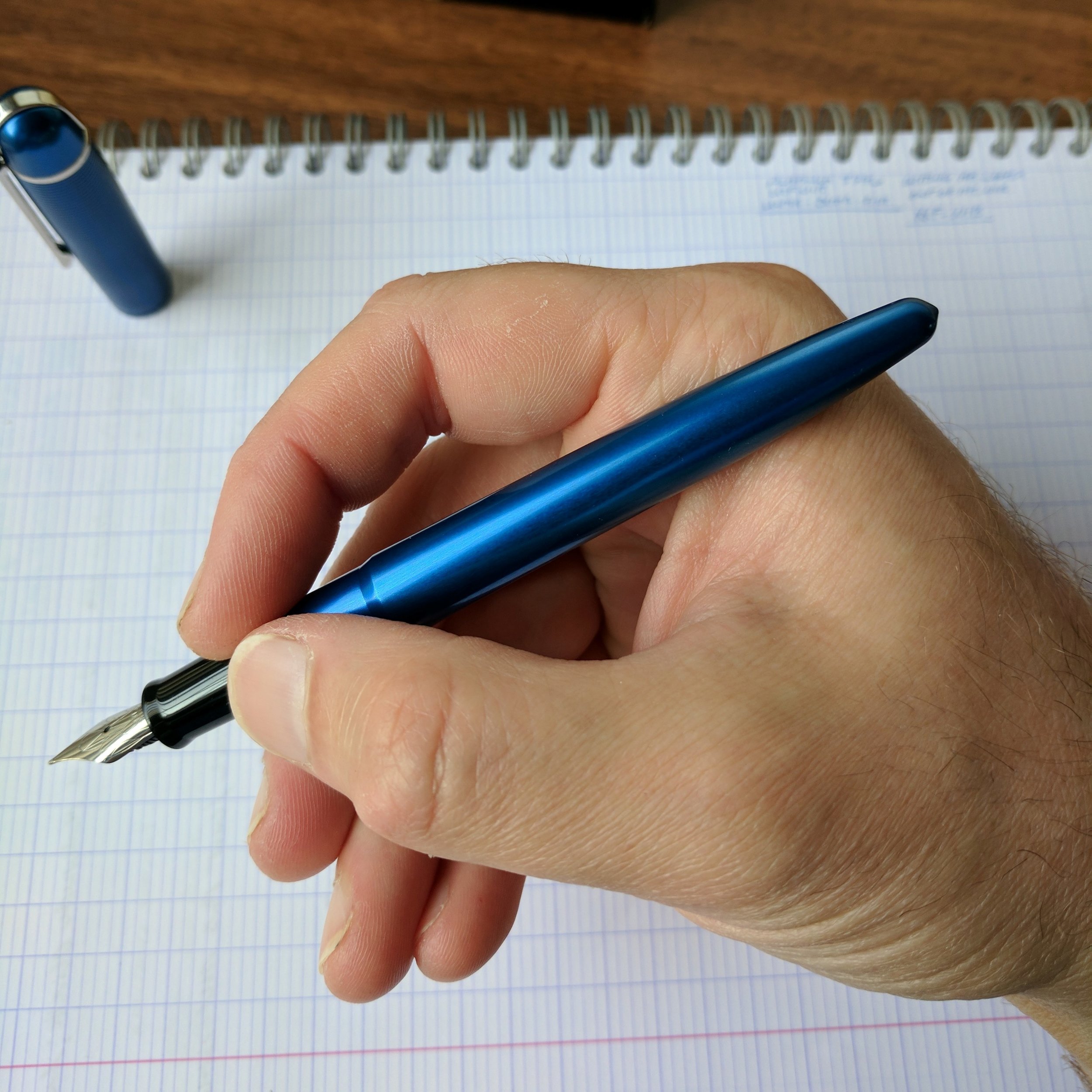
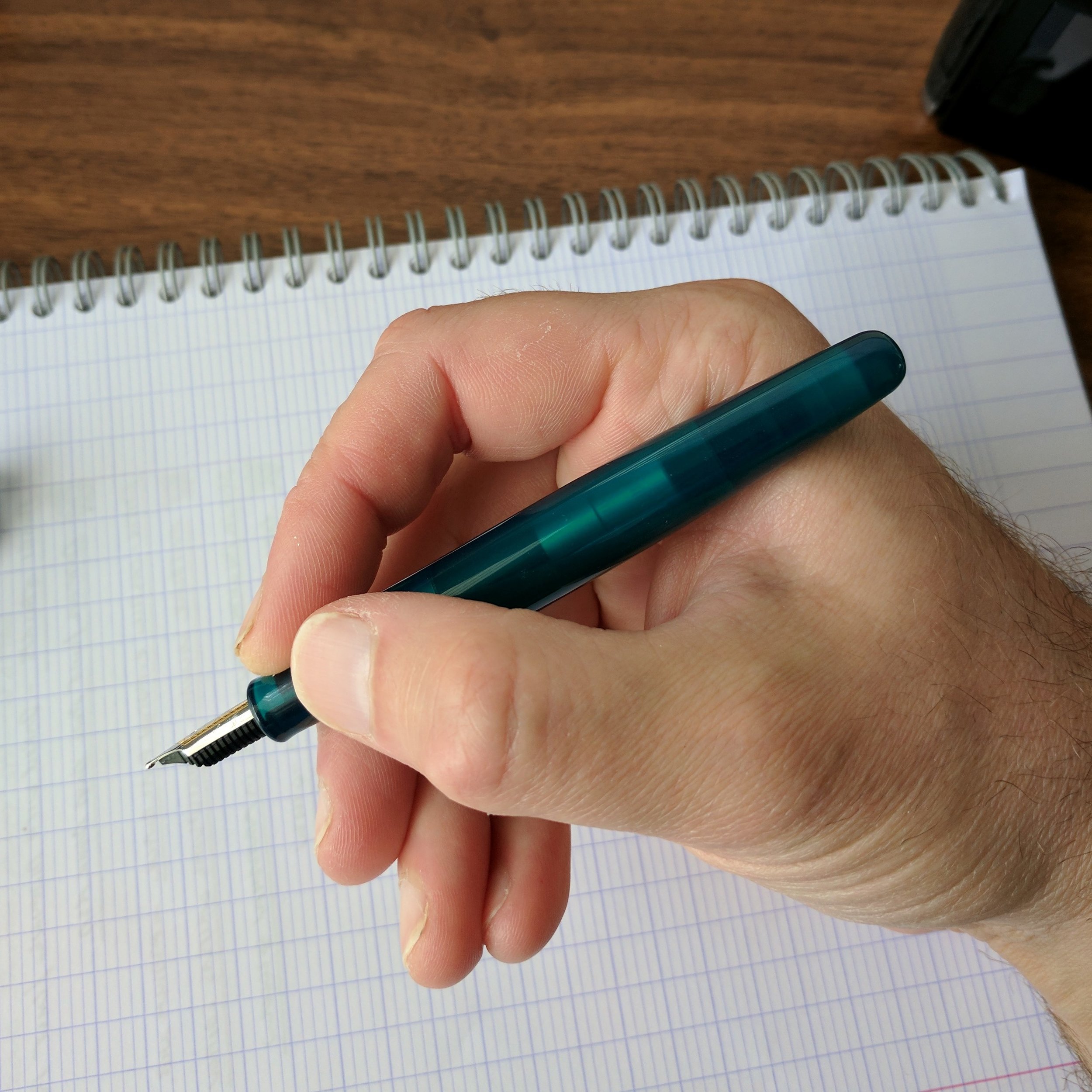
The Spectrum is a classic, cigar-shaped pen that I could comfortably use posted or unposted. With the rounded ends, the shape reminds me, again, of the Platinum 3776 or even a Nakaya Portable writer. I did find myself wishing that the cap posted just a touch deeper, like the cap on the Platinum, but I probably value this sort of versatility more than most - I'm a hardcore "poster." There's also a bit of a step from the body to the grip section and metal threads. Neither bothered me, but be advised of the potential issue if sharper threads and steps on pens have a tendency to dig into your hand.  

View fullsize Taccia Spectrum Unposted

The Spectrum comes in three attractive shades of translucent acrylic: Merlot (which is a brighter red than the name would suggest), Ocean Blue, and Forest Green (reviewed here, which in person looks lighter and a bit more teal). These technically qualify as "demonstrator" pens, but the effect is more subtle here since the acrylic isn't completely transparent. 

The one design choice I wish Taccia had done differently was the logo - this appears to be an applied logo - not etched - so I worry it may wear off over time. 

Taccia and Sailor share a U.S. distributor (Itoya), and Taccia has leaned heavily on their relationship with Sailor when marketing this pen. Both the Spectrum and the Pinnacle feature Sailor stainless steel nibs. The Taccia representative in Baltimore indicated that a gold-nib option was available for a sizeable upcharge, but I've not seen this option available at retailers so far.

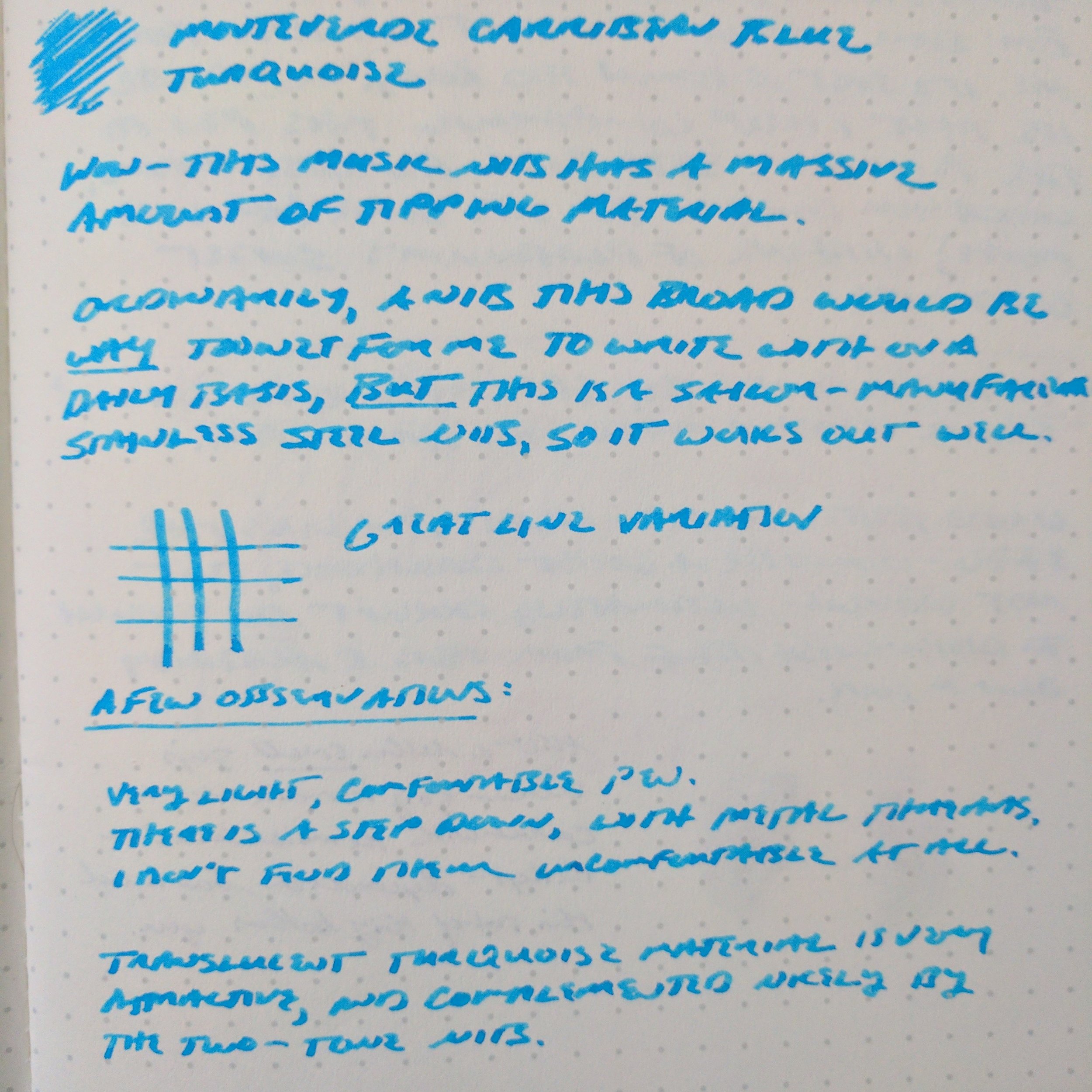
No complaints whatsoever about the Sailor stainless steel music nib - it was super smooth, with a ton of tipping material. 

The stainless steel music nib on the Spectrum is more appropriately characterized as a stub - Sailor music nibs don't have three tines, as you would find on a classic music nib. My Spectrum wrote quite smoothly, with a surprisingly even ink flow more suitable to my writing style than the wetter 14k or 18k Sailor music nibs I've tried in the past. I didn't experience any skipping or hard starting. 

The review ink here is Monteverde Caribbean Blue. This Sailor steel music nib gave me decent line variation, and wrote a slightly narrower line than its 18k and 14k equivalents. 

The review ink here is Monteverde Caribbean Blue. This Sailor steel music nib gave me decent line variation, and wrote a slightly narrower line than its 18k and 14k equivalents. 

Takeaways and Where to Buy 

At the current price point, Taccia is competing not only against other high-quality steel-nibbed pens like the Diplomat Aero and the Pelikan M205, but also against the Platinum 3776 and the Sailor 1911 Standard, both of which feature very nice 14K nibs. Based on my brief experience with the Spectrum, it should hold its own, though this market segment can be difficult to thrive in given the extent of the competition. The nib is the key selling point here, and if you're a fan of Sailor nibs and like the aesthetics of the Spectrum you won't be disappointed.    

Many thanks to the awesome team at Anderson Pens for loaning me this pen to review. Anderson Pens stocks both the Taccia Spectrum and the Taccia Pinnacle in a wide range of nib options, from extra fine to music. The Spectrum is currently priced at $127, and the Pinnacle at $119. 

Taccia pens on display alongside some gorgeous celluloid Platinum 3776s at the Anderson Pens table at the 2017 D.C. Pen Show.  On the far left, the Taccia Pinnacle, followed by two Taccia Spectrums in Blue Ocean and Merlot. 

Further Reading 

The team at Hand Over That Pen reviewed the Taccia Spectrum a few weeks back. Check out their review here. Apparently their review units were provided directly by Taccia, so they had the opportunity to sample both the steel and gold nibs. 

Disclaimer: Anderson Pens loaned me this Taccia Spectrum for review purposes at no charge. This post may contain affiliate links. 

In Pens Tags Taccia Spectrum, Pen Review, Taccia, Music Nib
2 Comments

Pen Review: Visconti Rembrandt Back to Black Edition

July 26, 2017

Of all the major pen brands, Visconti might be the one with which I have the least amount of experience. I own one Visconti pen - the Homo Sapiens Dark Ages - but very few of their offerings have spoken to me to the point where I would be willing to pay the premium prices that most Visconti pens command. Sure, there are a few special and limited editions that have made my "someday" short list (i.e., something with the Wall Street celluloid), but what's kept me from diving into Visconti in the same way that I have with other brands is Visconti's reputation for having QC issues with their nibs. Given that Visconti's signature 23kt palladium "Dreamtouch" nibs are somewhat high-maintenance, I wanted to see how the company did with something more basic. Appelboom was kind enough to loan me a steel-nibbed Visconti Rembrandt "Back to Black" for review.  

Design and Build

The Visconti Rembrandt features a classic streamlined profile with very few adornments or flourishes, other than the finial and the engraved cap band. The most notable feature of the Rembrandt is the magnetic closure, which reminds me a bit of the cap on the Steel & Flint pocket pen in that it makes a slight "pop" when you cap/uncap it (though not as audible). The Rembrandt also features Visconti's signature spring-loaded "bridge" clip, modeled after the Ponte Vecchio in Florence, which appears on most other Visconti pens. People either love this clip or hate it - some think it looks ostentatious, but I find it to be one of the more understated elements of Visconti design, which can be ornate and a bit over the top. The clip doubles as an excellent roll-stopper.  

Visconti's signature "Bridge Clip"

Visconti clearly intended the Rembrandt to serve as a "workhorse" pen. It's nicely balanced and a comfortable writer that I was fine using either posted or unposted. Some might find the metal section slippery, though generally ruthenium plating tends to add some "grippiness." Also, note that there are NO THREADS on this pen due to the magnetic closure, allowing for maximum versatility in how you grip the pen (low, high, etc.). I don't generally have a problem with section threads hurting my fingers unless they're exceptionally sharp, but if this is something that regularly poses an issue for your, the Rembrandt may be worth checking out.

Visconti "My Pen" Finial

The Rembrandt features Visconti's "My Pen" system, which you can use to swap out the finial on the cap for a personalized initial, zodiac sign (yes, I'm not kidding), or birthstone.

View fullsize Visconti Rembrandt Back to Black
View fullsize Visconti Rembrandt Posted
View fullsize Visconti Rembrandt Unposted

Nib and Writing Experience

As much as I wanted to love this pen, things fell apart with the nib, which was dry and "squeaky," for lack of a better term. The pen wasn't necessarily scratchy, but I could definitely feel and hear a LOT of feedback from the nib. I suspect this is probably due to the coating applied to the steel nib to give it the "blacked out" look. I've experienced variations of the same thing with other coated or plated steel nibs, but not this severe.

If you're considering this pen (or really any Visconti, for that matter), I'd add $40-60 to the cost to cover your nib work. You may luck out and get one that writes perfectly out of the box, but you're just as likely (if not more likely) to get a dry writer, hard starter, or skippy pen. To illustrate how all over the place Visconti's nib QC can be, check out Matthew's review of a different, unplated Rembrandt nib over at Nib & Ink, where he had a completely different (positive) experience.  

This broad nib definitely needs to be smoothed and have the ink flow increased. The ink is Kaweco Paradise Blue. 

Takeaways and Where to Buy

While I appreciated the look, feel, and balance of the Visconti Rembrandt "Back to Black," the coated steel nib didn't do it for me, though at Appelboom's attractive pricing you may still have room in your budget for a nib tuning. If I were going to purchase this pen, I'd personally consider paying extra to upgrade to the 23kt Palladium "Dreamtouch" nib. While those have their own issues, and typically need some minor adjustments, they are capable of being outstanding writers with a lot of character. 

Appelboom is currently offering the Visconti Rembrandt Back to Black edition for $129 US (excluding VAT). The "Dreamtouch" upgrade to the 23kt palladium nib costs an extra $140. 

Disclaimer: This pen was loaned to me for review purposes by Appelboom. I was not otherwise compensated for this review, and all views expressed here are my own.

In Pens Tags Pen Review, Visconti, Visconti Rembrandt
2 Comments
← Newer Posts Older Posts →
Store Hours and Events
Shop T.G.S. Online
Updated 2026 "Best Pens" Guide
No results found
On The Paper Trail: Live In Nashville Event Tickets Now Available!
TGS_25 Roterfaden Restock Notification
Hierarchies of Fountain Pen Friendly Paper

Join Our Patreon!
Subscribe to the TGS E-mail List

Featured Posts

Featured
10-Fountain-Pens-Favorite-Inks
August 22, 2026
Three Keeper Inks: Choosing Inks for 10 Fountain Pens
August 22, 2026
Read more →
August 22, 2026
Everyday-Stationery-Bags
July 25, 2026
What's the Best Everyday Stationery Bag? My Own Considerations and 5 Options for Pen Show Season
July 25, 2026
Read more →
July 25, 2026
Graphilo-Kobeha-Paper.jpg
July 11, 2026
Paper Review: Graphilo by Kobeha
July 11, 2026
Read more →
July 11, 2026
The Gentleman Stationer RSS

View Cart

© Digital Divide Media, LLC, 2014-present.

All content is the exclusive property of Digital Divide Media, LLC, d/b/a The Gentleman Stationer, including “The Gentleman Stationer” website and trademark, and should not be reproduced without express written permission.  All rights reserved.

All content containing paid advertising, affiliate links, or sponsored content will be plainly disclosed by a disclaimer when/if featured.

Contact Information

Website Terms and Conditions

Store Shipping Policy and Return Policy

Privacy Policy and Cookie Policy

Accessibility Statement

Powered by Squarespace