• Blog
  • Shop
  • Podcast
  • Resources
  • Archive
  • About
  • Contact
  • Cart
  • Sign In My Account
Menu

The Gentleman Stationer

Vintage Living in the Modern World.
  • Blog
  • Shop
  • Podcast
  • Resources
  • Archive
  • About
  • Contact
  • Cart
  • Sign In My Account

Pen Review: Montegrappa Fortuna in White, Silver, and "The Mule"

July 8, 2017

Montegrappa is one of those brands that didn't make it onto my radar until relatively recently, when I was offered the opportunity to borrow one of their higher-end Passione pens in a stunning red celluloid. My positive experience with that pen got me interested in learning more about the brand, so I placed an order for a Montegrappa Fortuna in white with ruthenium trim. At the same time, Cary at Kenro Industries (Montegrappa's U.S. distributor) loaned me two additional pens: the recently released Fortuna Silver and one of last year's "it" pens, the Montegrappa Mule, which is essentially a copper and steel Fortuna. (You may recall seeing photographs from "Mule parties" on the pen show circuit.)

First Impressions

Aesthetically, the Fortuna ticks all the right boxes for me. I love the shape of this pen, which is a variant of the classic cigar shape and fits into my hand nicely. I also appreciate the classic, understated design - not always something that I can say about Montegrappa pens, especially on some of their more elaborate creations.

The coating on the brushed stainless steel Fortuna Silver reflects the light in a way that makes the pen appear to have varying shades of light and dark. The effect is very attractive and gives what would otherwise be a relatively plain stainless steel pen a more unique look. 

The build on these pens is quite sturdy - you don't have to worry about the Fortuna (and certainly not the copper and steel versions) holding up to the rigors of everyday use.  All feature very tight "rollerball" clips, and if I had one critique on the build it would be that the clips are too tight - it's often hard to get this pen to clip to a shirt pocket or a pen slot in one of my bags. 

Montegrappa Fortuna engraved cap band and "roller" clip

These pens also feature metal threads, which is likely a good thing for durability, but at least on my white Fortuna causes the threads to "squeak" a little bit when capping/uncapping. The noise is less pronounced on the all-metal pens, so it may have something to do with the black coating on the trim.  One thing I do appreciate is that while the barrel threads are metal, the internal threads (on the inside of the cap) are plastic, even on the Mule and Fortuna Silver. That way, when you post the pen the threads won't scratch the barrel, as pretty much always happens to any other pen with a metal cap. (Montblanc, take a hint here.)  

Writing Experience

All three of the Fortunas were extremely comfortable writers. The acrylic pen is a fairly light pen, and the easiest to write with for an extended period of time.  The metal threads at the front of the pen give it a nice forward balance with good control. Even the (much) heavier Fortuna Silver (made of stainless steel) and the Mule (made of copper) don't feel too heavy, due to the shape of the pen and how the weight is distributed.  I could use any of these three pens posted or unposted, which surprised me a bit because all-metal pens typically tire my hand out after about a page. Montegrappa did an excellent job of designing around an issue which could potentially make the Mule and the Fortuna Silver unusable for a lot of people. 
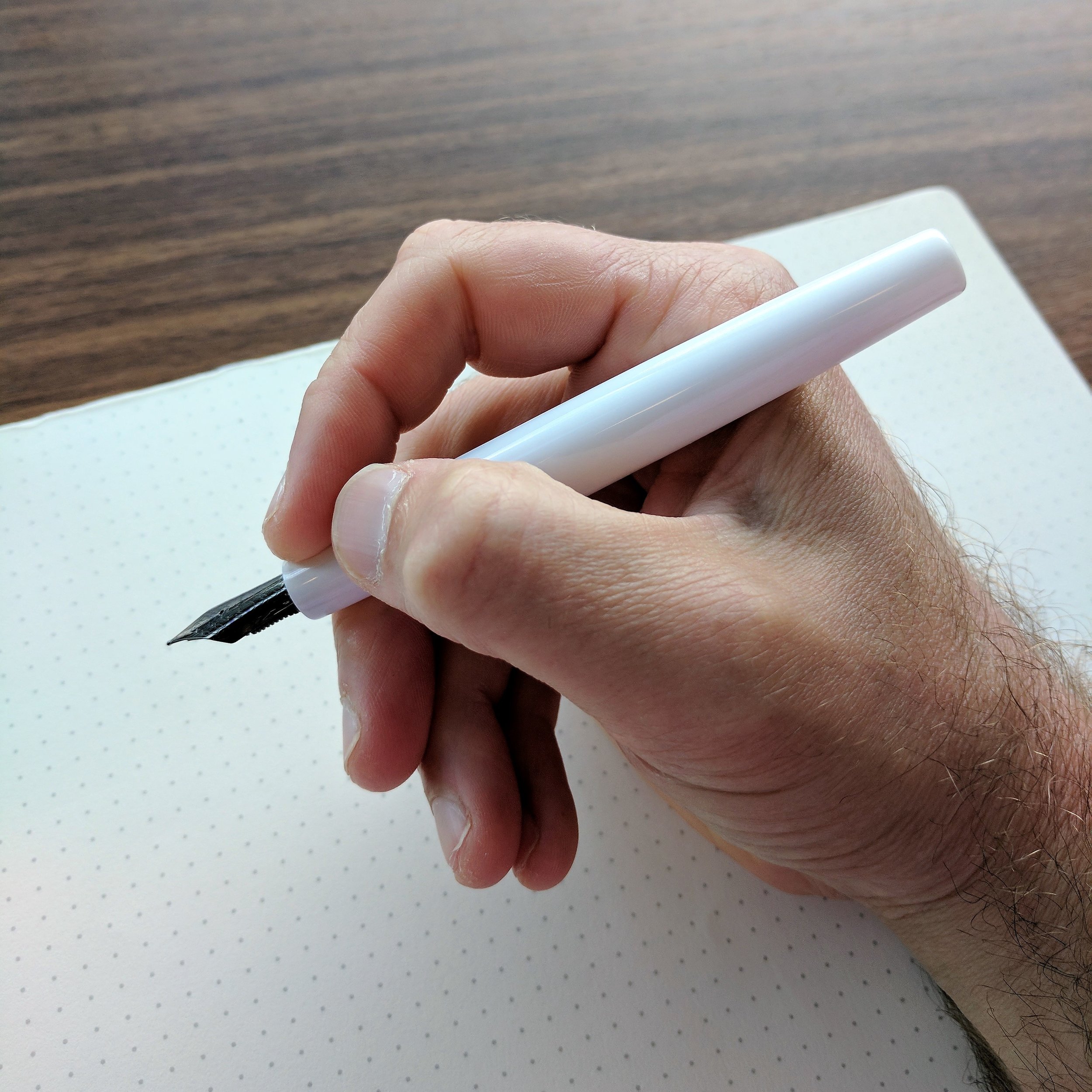
View fullsize Montegrappa Fortuna Unposted
View fullsize Montegrappa Fortuna Posted

While some have experienced flow issues with the Fortuna nibs, these three pens all wrote well without any hard starting or skipping.  Should you experience problems with your nib, I'd first clean the pen with a bit of soapy water (use diluted dish soap) or pen flush to rinse out any manufacturing residue (oils, debris, etc.), and if the problems continue notify your retailer or Kenro, who will take care of you.  I've not heard much about this recently, so Montegrappa may have resolved any production issues.   

Of these three pens, the white is my favorite, mainly because of the nib.  For some reason that I've not (yet) taken the time to research, black ion or ruthenium-plated nibs tend to be a touch softer than standard gold or steel nibs.  They're not "flexible" by any means, but they do have a bit more bounce to them. The standard steel nib on the Fortuna Silver and the Mule was definitely drier and stiffer than the black plated nib on the white acrylic pen.  I've noticed the same thing on my black ion-plated Sailor Professional Gear Imperial Black and Sailor 1911 Black Luster fountain pens - they're both softer than the standard Sailor gold nibs, which are notorious nails. 

Another note on the plated nibs - they have a tendency to corrode when used with inks containing iron gall.  I made the mistake of using Montblanc Midnight Blue (old formulation) and Montegrappa Blue Black with this nib, which resulted in the plating wearing away around the nib slit and at the base of the nib. Be warned. 

Montegrappa nibs, in my experience, also write narrower than their designation. The Mule and the Fortuna Silver both had broad nibs that to me were really classic mediums. I'm typically not a "broad nib" person because I do a lot of copy editing and margin annotations at work and need to write fairly small, but I could use this Montegrappa broad nib easily. Even so, I still preferred the medium nib on the white/ruthenium pen. It wrote a consistently wet line and even offered some stub-like line variation on the cross strokes.    

Takeaways and Where to Buy

Most Montegrappa retailers such as Vanness Pens and Pen Chalet will carry the Fortuna, especially since Montegrappa seems to be making the Fortuna line its primary - and certainly its most accessible - line of pens. That said, "accessibility" is relative, and these pens still come with a luxury premium on the price. The White/Ruthenium Fortuna retails for $290, and the Mule sells for $375.  The recently released Fortuna Silver is priced at $395.  Montegrappa is fairly insistent on retailers adhering to their standard pricing, and while you can sometimes find a slight discount off of MSRP, it's rare.

Are these pens worth the money? As always, it depends on what you are looking for. You can certainly find excellent writers with gold nibs for less money, and I'd personally be hard-pressed to choose the Fortuna over a Sailor Pro Gear, which can be less expensive and is possibly my favorite pen of all time. Price notwithstanding, the size and feel of the Fortuna make it an extremely comfortable pen to use, and Montegrappa has released this pen in some unique, beautiful designs and color schemes, which is the real value here. I highly encourage you to check out the Mosaico Marrakech, as well as the upcoming Fortuna "Heartwood" line.

A big thank you to Kenro Industries for making this review possible, and I look forward to seeing what else Montegrappa has in store for the Fortuna line.  

Disclaimer: I received a discount on my purchase of the White Fortuna directly from Kenro, who also loaned me the Montegrappa Mule and Silver Fortuna for review purposes. This post contains links to affiliates and sponsors.       

In Pens Tags Pen Review, Montegrappa, Montegrappa Fortuna
Comment

Pen Review: Pelikan M101N Bright Red

June 24, 2017

Pelikan's annual release of its vintage-inspired special edition M101N fountain pen has become a bit of an event, with collectors anxiously awaiting each announcement. Pens in the series have included the M101N Tortoiseshell Red, the M101N Tortoiseshell Brown, and the M101N Lizard. All recreate the look and feel of vintage Pelikan pens from the 1930s. Many thanks to Appelboom for loaning me this year's model, the M101N Bright Red. 

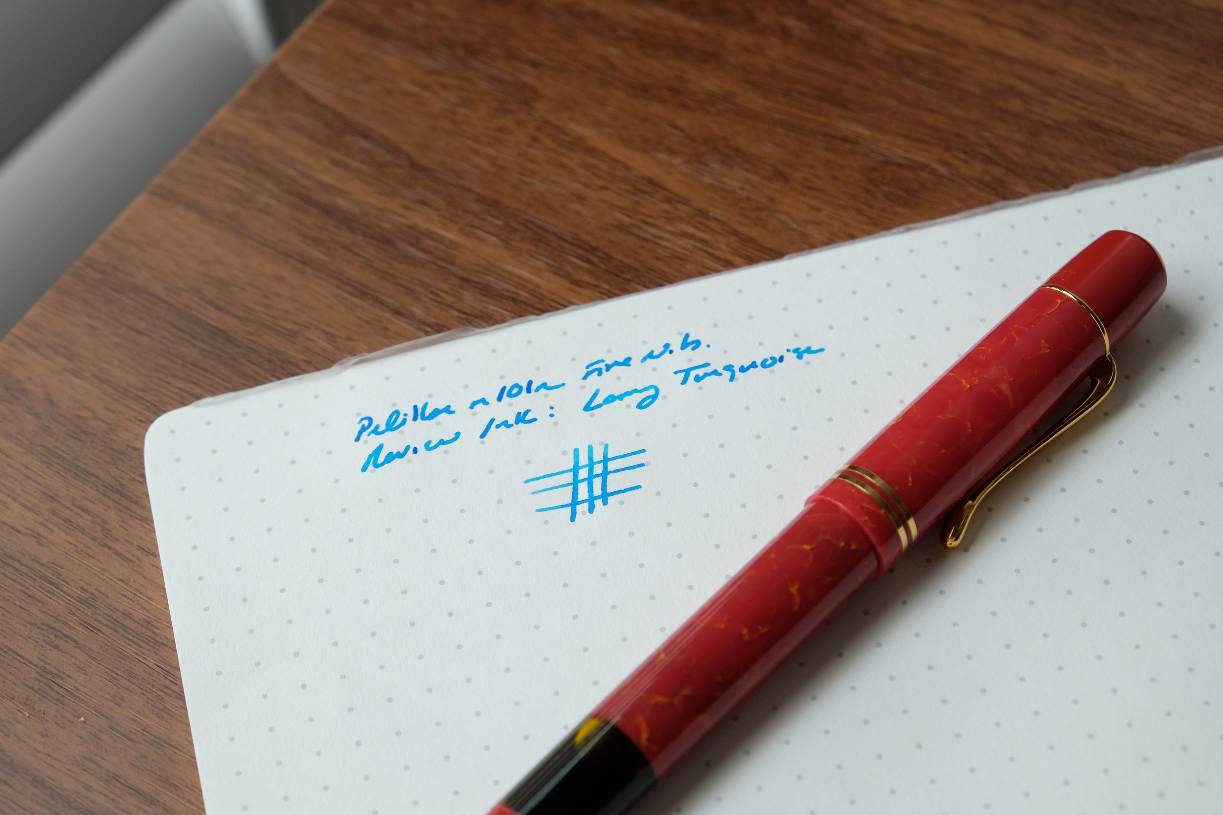
The Bright Red acrylic does a fairly nice job of mimicking the appearance of vintage celluloid.

Appearance and First Impressions

The Pelikan M101N is larger than I originally anticipated. For some reason, I expected this to be a smaller, almost "pocket-sized" fountain pen. That's not the case - it's a decent sized pen at 4.5" unposted and 6.2" posted. Pelikan packages each pen with its customary white "penvelope," and includes a special bottle of Pelikan 4001 blue "Konigsblau" ink with a vintage-inspired label. It's very attractive packaging, and certainly complements the pen. 

A nice bonus - this Pelikan 4001 vintage-style "Konigsblau" ink bottle.

To me, two things make the M101N's design distinctive: the cap and the ink window. The cap features an elongated "cap head," with the clip set lower on the cap than you would ordinarily see. It's an interesting look - again, vintage-inspired - but it's not really my thing. The pen also sports 24kt gold trim, and I do appreciate the double cap band. The yellow ink window offers nice visibility, and on this particular pen it provides some variety to what would otherwise be a solid red pen.  

A close up of the nib, ink window, and "Bright Red" acrylic

You all know that I'm a sucker for red pens, and Pelikan did a nice job with the marbled acrylic. You can tell that they tried to mimic the look of vintage celluloid, and pull it off fairly well (at least to the casual observer). The acrylic doesn't have the camphor smell or warmth of real celluloid, but it's still visually attractive. Both the piston knob and the "cap head" (Pelikan's term) are made from synthetic resin, which supposedly "polishes itself as it is used - meaning that Bright Red continues to shine." Huh. I've never heard that one before, but the material is shiny. Take it for what it's worth. 

Writing Experience

Like nearly all Pelikan pens, the M101N is a piston-filler. And like nearly every Pelikan pen that I've written with, the piston mechanism worked smoothly without a hitch and held a fair amount of ink. The 14kt gold fine nib was moderately wet and wrote what I would characterize as a traditional medium line. Again, this is something I notice with every Pelikan pen out there, and generally recommend that readers purchase one Pelikan nib size down from the size they actually want, if they haven't had the opportunity to try the pen themselves at a pen show. To get a truly extra-fine nib, you'll likely need to have the nib ground.

Vintage-inspired engraving on the Pelikan M101N Bright Red

The M101N is a very light pen, and would serve nicely as an everyday writing instrument. Posted or unposted, it was comfortable to use, though I found the length a bit too "in-between" for me. The pen was slightly too short unposted, and slightly too long posted. Keep in mind that this reflects my personal preferences more than anything else, but I'd say that this is a pen you'd want to "try before you buy," especially at the price point.  

View fullsize Pelikan M101N Capped
View fullsize Pelikan M101N Unposted
View fullsize Pelikan M101N Writing Sample (Fine Nib)

Takeaways and Where to Buy

The Pelikan M101N is a solid pen, and provides an outlet for those people who appreciate the style of early vintage Pelikan, but may prefer to stick to modern writing instruments as their daily users. Though I'm one of those people, this particular model doesn't really speak to me aesthetically, and if I was to purchase an M101N my personal tastes gravitate more towards the Brown or Red Tortoiseshell models than the Bright Red. If you like the look of this pen, however, it's a Pelikan, and Pelikan's are great writers that should provide you with years of reliable service. 

You can purchase the Pelikan M101N from Appelboom for around $450 (excluding VAT). The M101N pens sit at a high price point, but they are special editions made in smaller production runs, and in any event the pricing is fairly consistent with Pelikan's other high-end piston fillers with a gold nib. While it's a special edition that won't be around forever, as a practical matter these M101N pens tend to remain in stock for at least a couple years.

Disclaimer: Appelboom loaned me this pen for review purposes, free of charge. Many thanks!


In Pens Tags Pelikan, Pelikan M101N, Special Edition, Limited Edition
Comment

Pen Review: Kanilea Pen Co. Mauna Kea

June 17, 2017

I've been waiting for a couple of months now before publishing a review of what might be my favorite pen acquisition of the past year: the "Mauna Kea" by the Kanilea Pen Co. Kanilea is new to the scene, even if Hugh and Karol Scher, the proprietors, have been around the pen show circuit for years. Kanilea launched at last year's Washington D.C. Pen Show to much acclaim - certain models of their pens sold out immediately. Each piece in their lineup is inspired by a location or "element" in Hawaii, and is hand-turned from a custom acrylic reflecting the colors in pictures taken on family trips to the islands. Even though these pens aren't "custom" in the sense that they're designed to individual customer's specifications, every aspect of these pens has been custom-designed to the maker's specifications, and even the JoWo nib has been tuned to perfection. It's a unique product, and you're not going to find anything like it elsewhere. I don't give numbered "ratings" to reviews, but if I did I'd give the Kanilea Mauna Kea as close to a perfect score as any pen I've reviewed in the past two years.  

Each Kanilea pen features a sterling silver or plated sterling silver medallion inset into the cap.

Design and Build

Hugh Scher turns each pen by hand, using custom acrylics made by Jonathan Brooks of the Carolina Pen Company. I don't own any of Jonathan's pens, but I can vouch for his ability as a material maker. Hugh's workmanship on the pens themselves is exceptional. With any handmade pen you should expect some degree of imperfections and inconsistency in each finished product - to a degree, that's what makes a hand-crafted pen unique - but I honestly haven't been able to find any such "flaws" on my Mauna Kea. The cap is centered, the threads are smooth, the edges rounded perfectly, and as I'll talk about a bit more later, the nib writes exceptionally well.  

The depth of the material is what drew me to the Mauna Kea Model in the first place. 

The depth of color and contrasting swirls of brown and white/ivory drew me to this particular model. As the name suggests, the pen is inspired by Mauna Kea, the volcano on Hawaii's "Big Island." Because the acrylic blanks are hand-poured, each Kanilea pen is unique in both color and pattern, even among the same model. In other words, my Mauna Kea has a different mix of browns, whites, and pearlescent swirls than any other Mauna Kea pen out there. When you visit Kanilea at a pen show, you'll have the opportunity to see this in person, handle the individual pens, and choose which one you like best.  

The selection of Kanilea pens available at the Baltimore Pen Show, to hold and test out. (Less one Mauna Kea...)

Kanilea pens come in several different shapes, or "design profiles," but not all are available in every model. From speaking with Hugh at this year's Atlanta Pen Show, I learned that Kanilea makes each model in those profiles that best showcase the material. For example, the Mauna Kea is only available in the "Classic Flush" profile, a streamlined clipless design. Other models, such as the Pahoehoe, Nui Nalu, or Kilauea, are available in different profiles and have the option of adding a clip, which I might choose for my second Kanilea pen just to mix things up. If fountain pens aren't your thing, certain models of Kanilea pens are also available as ballpoints. 

My Mauna Kea right after I purchased it, above the photograph that inspired the pen's design. 

Nibs and Writing Experience

Kanilea-Pen-Co-Mauna-Kea-Nib-Section

Kanilea pens use No. 6 JoWo nibs, in either polished stainless steel, two-toned gold-plated stainless steel, or 18k gold. JoWo nibs are fairly standard in the custom pen world, and most pen makers use nibs manufactured by either JoWo or Schmidt due to their reliability. JoWo nibs are also about as close as you can get to having a "universal nib unit," since most pens featuring JoWo nibs use standard screw-in nib unit, and a Kanilea nib unit, for example, should be interchangeable with a nib unit sold by Franklin-Christoph, Scriptorium, or Edison Pens. 

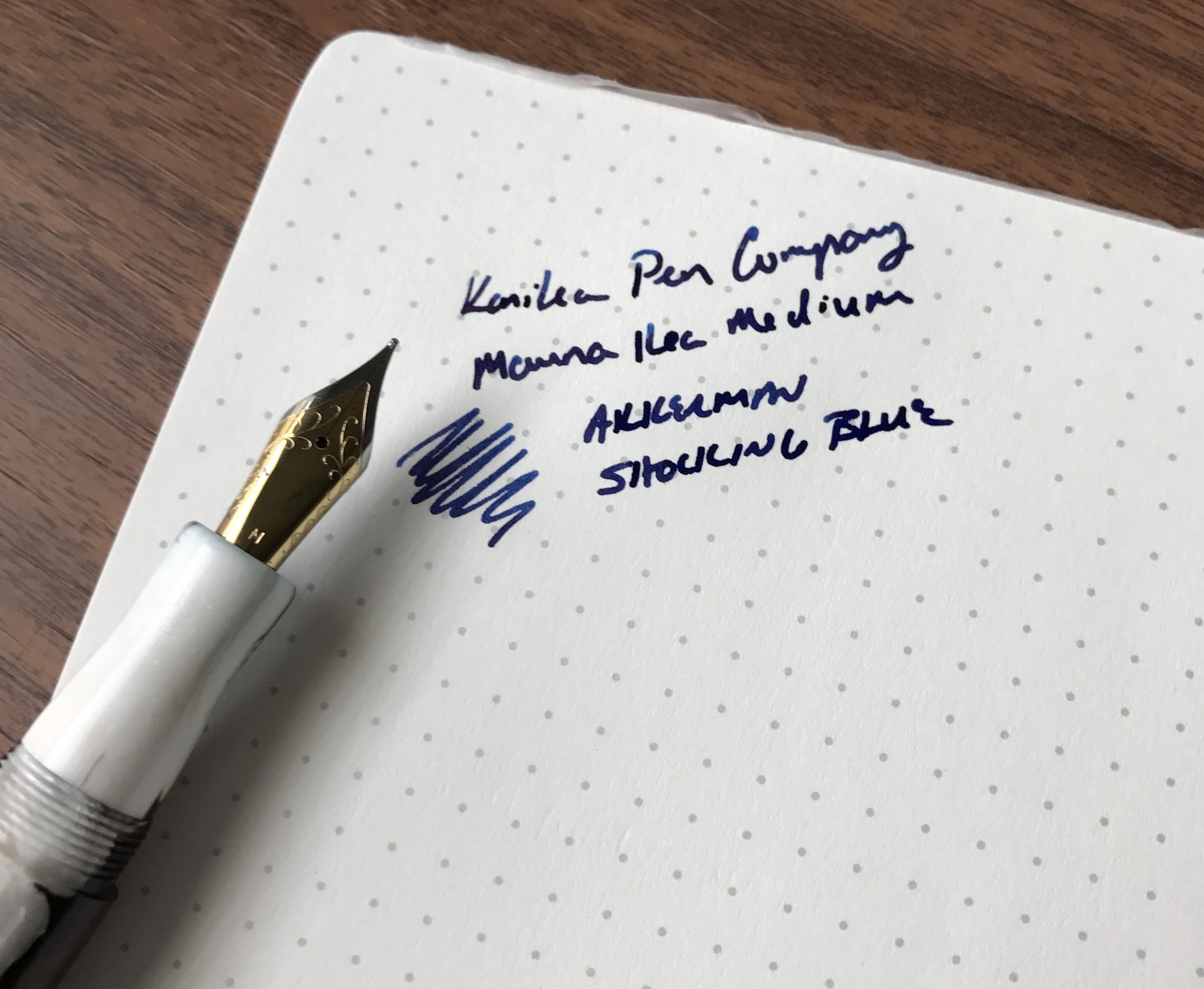
I must say that the medium nib on my Mauna Kea is, hands down, the best JoWo nib I've ever written with (and I'm not the only one to say so.) Hugh works on each nib individually before handing over your new pen, and if you visit Kanilea at the pen show, you'll have the opportunity to have Hugh adjust it to your preference, in terms of ink flow, smoothness, etc. Kanilea carries a range of JoWo nib sizes, from extra fine (EF) all the way up to a 1.1mm stub nib.

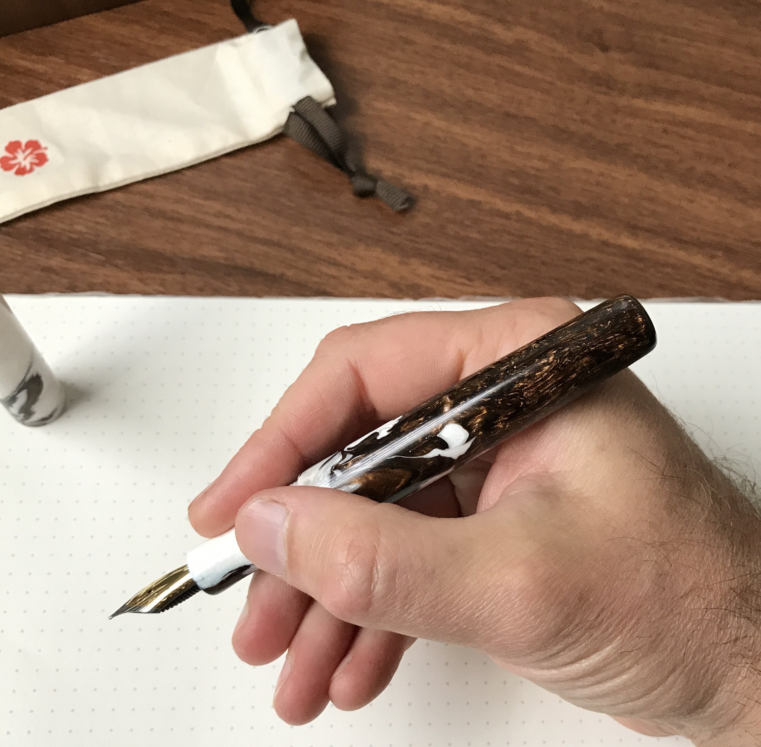
View fullsize Mauna Kea in Hand
View fullsize Kanilea Mauna Kea Section
View fullsize Kanilea Mauna Kea Nib and Writing Sample

The shape of the pen makes the Mauna Kea an excellent writing instrument for longer sessions. The cylindrical profile, with the barrel tapering slightly towards the back, balances the pen nicely, and the lightweight acrylic ensures your hand won't tire. The concave section offers a comfortable grip, and the threads are both high enough on the section and smooth enough so as not to dig into your hand. You can't post the cap, but this is a larger pen so you probably wouldn't want to anyway.   

Takeaways and Where to Buy

If you're in the market for a unique piece to add to your collection, I highly recommend a pen from the Kanilea Pen Company. Kanilea doesn't sell through retailers (at least not yet), so you will need to purchase directly from them, either via their website or at one of the pen shows they attend. I'd highly recommend visiting them at either the upcoming DC Fountain Pen Supershow (August 3-6), or the San Francisco Pen Show (August 25-27).

It's not pictured here (because it's buried in my backyard) but the box comes wrapped in a biodegradable paper band with the Kanilea logo, which has wildflower seeds embedded in it!

It's not pictured here (because it's buried in my backyard) but the box comes wrapped in a biodegradable paper band with the Kanilea logo, which has wildflower seeds embedded in it!

Kanilea pens are not inexpensive, starting at $395, with gold nibs costing an additional $120. The price initially might seem high for an acrylic pen with a steel nib, but once you consider (1) the unique nature and cost of these particular custom acrylics; (2) the quality; (3) the fact that all Kanilea pens are entirely turned by hand; and (4) that all Kanilea pens feature a custom designed medallion crafted from sterling silver or 14K gold-plated sterling silver, the pricing makes sense. Each pen also comes with a "keepsake box" handmade from polished black walnut, which I keep on my desk and use as a pencil box. It's a high quality add-on, featuring a hidden hinge and a magnetic closure. I certainly feel that I got my money's worth. 

Disclaimer: I purchased this pen with my own funds, for my own collection. I was not compensated in any way for this review. 

In Pens Tags Mauna Kea, Kanilea Pen Co., Pen Review
2 Comments

Pen Review: Montblanc for UNICEF Solitaire Doue Classique and UNICEF Blue Ink

June 10, 2017

Conventional wisdom says that as you fall deeper and deeper down the stationery rabbit-hole, you start to develop a taste for more expensive products, whether that be a $1000 fountain pen or a $5 pencil. I don’t think that’s necessarily true in the sense that most people think - that you lose your enjoyment for the "simple things" - because I still enjoy a $20 Lamy Safari as much as I do a very expensive pen such as this one, just in a different way. I do think, however, that you start to develop a better sense / appreciation for why certain pens command the pricing that they do, and if your budget allows, become more willing to pay for artistry over pure function. The Montblanc for UNICEF Solitaire Doue is a great example of this. 

Background on the Montblanc for UNICEF Line

Before I jump into a review of the pen itself, I wanted to talk a bit about the Montblanc-UNICEF partnership and the idea behind this pen (as well as the other pens in this line and the limited edition ink). UNICEF (short for the United Nations International Children’s Emergency Fund) promotes the rights and wellbeing of children around the world, especially those in impoverished and/or war-torn areas. Montblanc has partnered with UNICEF for years to raise money and awareness - more than $10 million since 2004 - but as far as I know this is the first time Montblanc has released any sort of UNICEF-themed product.

All of the Montblanc for UNICEF pens feature an inlaid sapphire. 

In April, Montblanc and UNICEF announced that they would be continuing their partnership. Montblanc’s collaboration with UNICEF focuses on providing access to education, with a particular focus on helping children learn to read and write. Around the same time, Montblanc released a new line of UNICEF-themed pens, as well as a limited edition “UNICEF blue” bottle of ink. Montblanc donates a portion of the proceeds from the sale of these products to UNICEF. 

“Montblanc, in partnership with UNICEF, aims to improve learning conditions for over 5 million children around the world by providing quality learning materials and better teaching. ”
— Montblanc

The Montblanc website sets out the full details of the promotion: “Unicef does not endorse any brand or product. For every piece in the ‘Montblanc for UNICEF Collection’ sold from April 1 2017 to March 31 2018, Montblanc will donate 3% of the proceeds to support UNICEF and its literacy projects, with a minimum amount of $1.5 million being guaranteed by Montblanc.” 

3% of each pen sold is not a huge percentage. (To illustrate, 3% would mean that for every $1000 of pen sold, UNICEF would receive $30.) That said, a major aspect of this sort of project is the raising of awareness about the organization, and kudos to Montblanc for choosing UNICEF. I’d also note that Montblanc does not appear to be making money off of a “UNICEF markup.” The pricing is similar, if not a bit lower, than their other “Solitaire Doue” limited editions such as the “Blue Hour”. Given the UNICEF model's platinum plating and trim, inlaid sapphire, and the intricate design and workmanship, this is, in all likelihood, an expensive pen for Montblanc to make and my guess is that the overall profit margin is slim. I’m not at all trying to cast shade on the Montblanc-UNICEF collaboration or any other corporate-charity partnership. UNICEF has been partnering with Montblanc for more than a dozen years, so one can only assume they find the collaboration valuable. The only reason I mention the “real numbers” behind the special edition is because (1) I know people are going to ask, and (2) someone shouldn’t purchase this pen thinking that he or she is making a $1000 contribution to UNICEF. If that’s what you want to do, you’re better off donating to UNICEF directly, and I’d invite you to visit the organization’s webpage to learn more about it. 

A Design Inspired by the Rosetta Stone

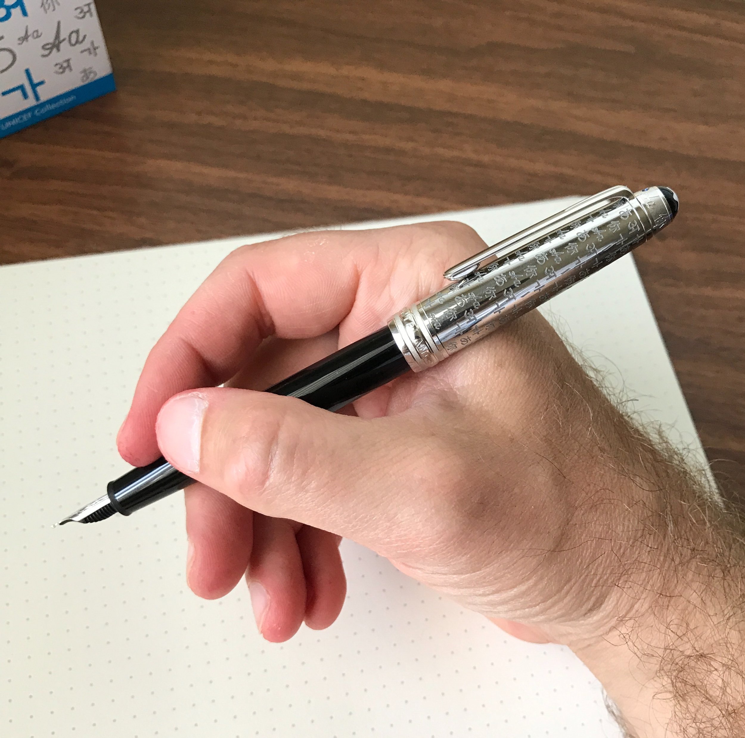
The design on the cap is “inspired by the Rosetta Stone, an ancient artifact used to decipher Egyptian hieroglyphics.”

Now, on to the pen itself. The particular model featured in this review is the Solitaire Doue Classique (145). What does that mean? For starters, the 145 signals that it’s Montblanc’s smaller cartridge-converter pen, as opposed to the larger, piston-filling 146 or 149. (It’s not the smallest fountain pen Montblanc makes. That honor goes to the "W.A. Mozart".) From what I can gather, Montblanc uses “Solitaire Doue” to signify that the pen has a metal cap, which on this pen is platinum plated and engraved with the first letter of alphabets / calligraphies from around the world. Like all models in the Montblanc for UNICEF line, the cap also features an inlaid 1.3mm sapphire. With so many different design elements, you might worry that they would clash or look “too busy,” but Montblanc brings them all together very nicely. Overall, this is a very understated and classy writing instrument that I wouldn't hesitate to break out anywhere, especially in a business meeting. 

In my opinion, the Montblanc for UNICEF line has some of the better-looking special edition pens that Montblanc has released.

The barrel is Montblanc’s standard polished “precious resin,” with a twist: a metal end cap, which has the effect of nicely balancing the pen when using it unposted. Presumably, the design is inspired by the metal piston nobs that Montblanc has included on certain of its piston fillers, such as the Meisterstuck 146 Ultra Black. I initially wondered why they would include a similar feature on the cartridge-converter Classique, but after writing with this pen I understood. Despite its comparatively small size, the Solitaire Doue Classique is an extremely comfortable writer. The standard all-resin Classique, which I’ve owned in the past, it a touch too light for me to use without posting the cap, which as all Montblanc owners know will scratch the resin over time if you're not careful. 

Nib and Writing Experience 

The nib on the Solitaire Doue writes a nice wet line, and I had no trouble with ink starvation, hard starts, or skipping. As with my Heritage 1912, the quality control was exceptional. 

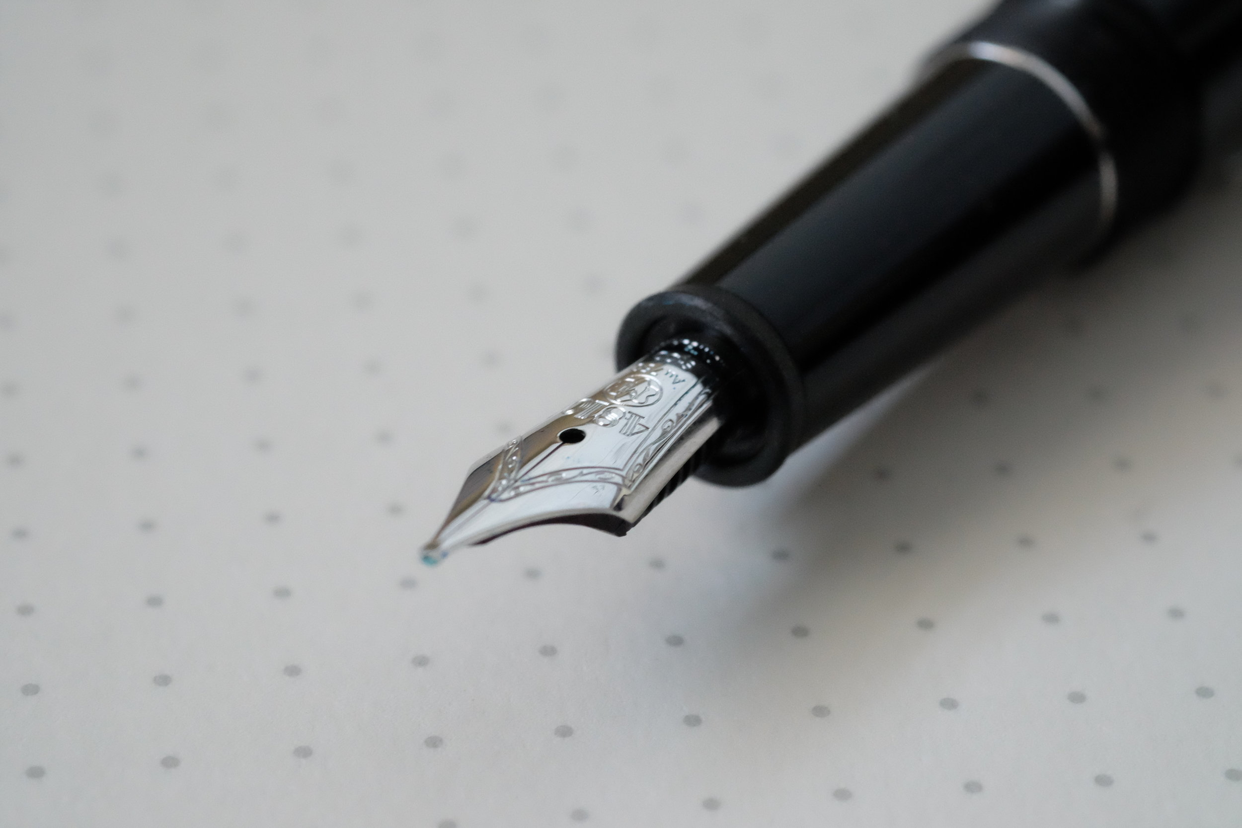
The UNICEF Solitaire Doue features a rhodium-plated 18k gold nib, which is not only very soft but, to me, slightly stubbish. This particular pen has a fine nib that writes more like a medium. I’d compare it favorably to the nib on my Heritage 1912, meaning that it’s soft and offers a touch of line variation, but wouldn't be considered flexible or semi-flex. I’ve personally enjoyed Montblanc’s smaller rhodium-plated nibs more than the larger nibs that appear on the 146 or 149, which tend to be more firm. 

View fullsize Montblanc-Nib-18K-Fine
View fullsize Montblanc-Classique-Unposted
View fullsize Montblanc-Classique-Posted
View fullsize Writing-Sample-Turquoise-Ink

The Montblanc for UNICEF Pens Are Accompanied by a Limited Edition UNICEF Ink 

Along with the pen, Appelboom sent over a bottle of the limited edition Montblanc for UNICEF Ink, which is UNICEF’s signature turquoise. It’s a beautiful color, which has just a touch of sheen and a lot of depth. Like all Montblanc inks, it flows well, dries quickly, and has limited feathering and bleed. I’ll definitely be picking up a bottle of UNICEF blue in the future, but this particular bottle will be given away on the blog early next week, courtesy of Appelboom! 

Takeaways and Where to Buy

The pens in the Montblanc for UNICEF line are easily some of my favorite Montblanc special editions in years, and this particular pen is my favorite of the bunch. Barring some unforeseen major expense disrupting my plans, this pen won’t be making its way back to the Netherlands. I enjoy the design, which serves as a nice conversation piece, and the nib on this pen is nothing short of phenomenal. While they're not within my budget, you may also want to check out several other items in the Montblanc for UNICEF collection, including the UNICEF 146, the Blue Solitaire 146, and the Skeleton 149 models.  

You can currently purchase this pen (and the ink!) from Appelboom in Laren, the Netherlands. Pricing with VAT included is $1033; without VAT the price is $855. Appelboom is an authorized Montblanc retailer that carries the full Montblanc line, and can fit your pen with one of Montblanc’s specialty nibs such as an oblique broad (OB), oblique medium (OM), or double broad (BB) if you so desire. 

Disclaimer: Appelboom loaned me this pen and the ink free of charge for review purposes. I was not otherwise compensated for this review. 

In Pens Tags Montblanc, Solitaire Doue Classique, Appelboom, Pen Review
Comment
Benu-Pens-Essence-Minima

Pen Review: Introducing Benu Pens (and Another Giveaway!)

May 24, 2017

A few weeks ago I was contacted by Kate Dmitrieva, the co-founder of Benu, a pen company located in Moscow, Russia, asking whether I'd be interested in reviewing some of their products. Intrigued by the unique designs and some really cool looking materials, I agreed and a couple weeks later the pens arrived at my door. Overall, I'm very impressed with the design and the quality of the writing experience, though many might consider the price point a touch high. Benu will be launching a Kickstarter for a new collection at some point in the future, so be on the lookout.    

Design and Build

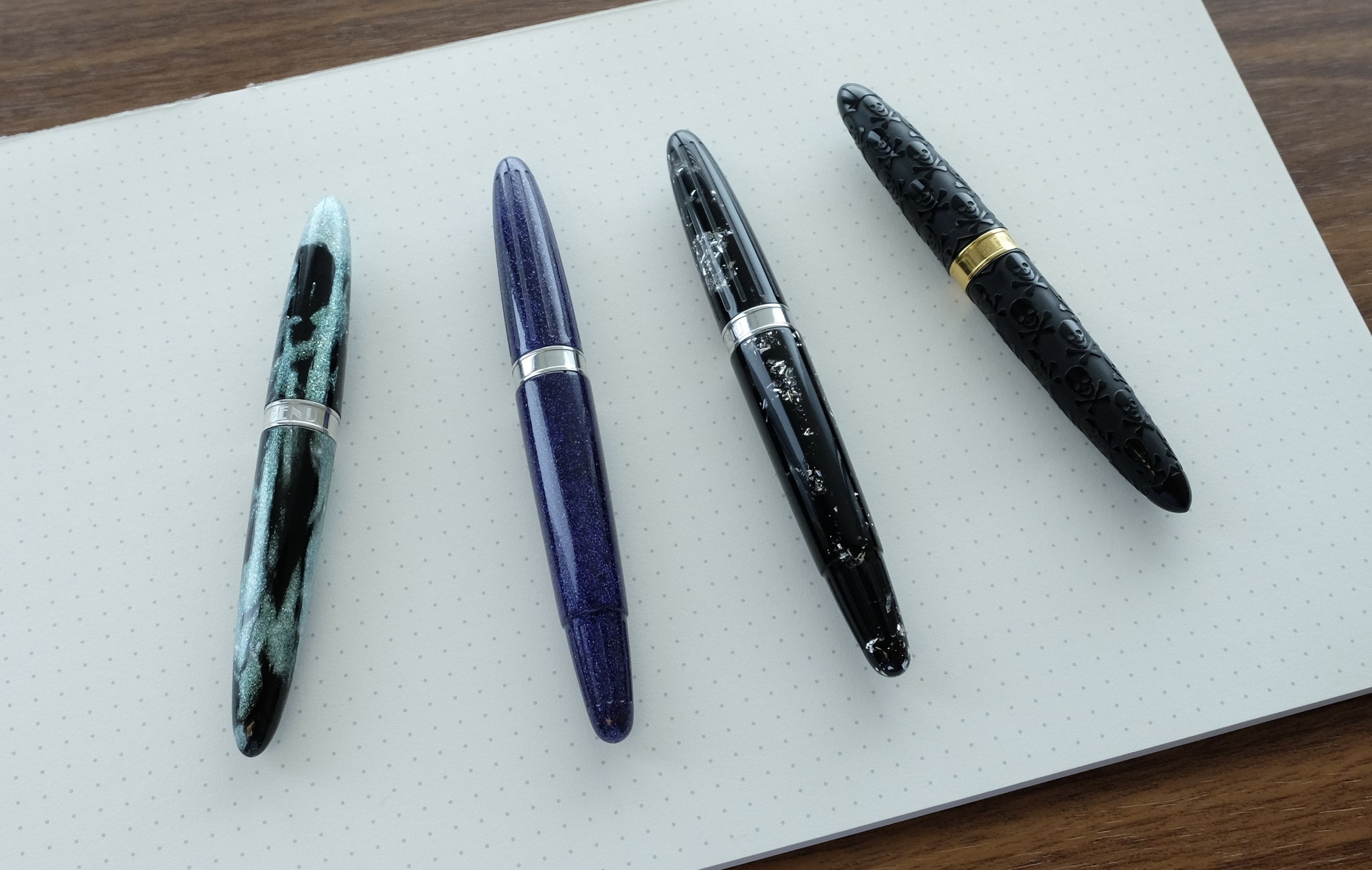
Benu bills their products as "casual chic writing instruments for work and leisure," that are "designed to surprise and delight." There's definitely a certain playfulness to these pens that make them fun to use, somewhat reminiscent of the many different variations Kaweco has released in its "Sport" line. The compact size, light weight, and streamlined "bullet" shape makes these pens a good choice for pocket carry. Benu pens sells its pens in two "collections": the "MINIMA" collection, which is more of a true pocket pen, cartridge-only, and does not post, and the "Essence" collection, which is slightly larger, accepts an international converter, and does post. (Comparison photos are available in the gallery below.)

A size comparison between the Benu "MINIMA" Skull Pen (right) and the "Essence" in Silver Galaxy (left)

Benu describes their pens as handmade from a variety of interesting "pearlescent" and "adventurescent" acrylic resins, and certain designs feature intricate etchings such as geometric and skull patterns.  The four pens I was sent for review include the Classic Black Skull with gold trim and Mystical Green Silver from the MINIMA collection, and the "Silver Galaxy" and "Purple Night Silver" from the Essence collection. All of the acrylics are eye-catching with lots of depth, and I found the detailing on the Skull Pen to be very attractive.  

A close-up of Benu's "Silver Galaxy" Resin (left) and the Skull Pen (right)

Nibs and Overall Writing Experience

Benu uses high quality stainless steel nibs from Schmidt. To be honest, the Schmidt nibs surprised me with how well they wrote directly out of the box. The broad nib I tested could almost qualify as a stub, and laid down a thick wet line of ink, while the fine nib wrote equally as smooth.  

A shot of the broad, gold-plated Schmidt nib on the Benu Skull pen. Check out the almost stubbish shape of the nib! 

A shot of the broad, gold-plated Schmidt nib on the Benu Skull pen. Check out the almost stubbish shape of the nib! 

The first thing some people might notice is that the section features a relatively large "step down" from the barrel, but this should end up being a non-issue for most people unless they grip the pen very high. The long section offers plenty of room for a variety of grip styles, and never caused me any problems. 

Despite the steep "step down," the long section should provide plenty of room for most hands to get a comfortable grip. 

While both the "Essence" and the "MINIMA" pens were quite comfortable to hold, I found the slightly larger "Essence" pen to be the most practical for longer writing sessions, due to just the touch of added length, better balance, and the ability to post the cap.  

View fullsize Benu MINIMA Skull Pen In-Hand
View fullsize Benu MINIMA Skull Pen Broad Writing Sample
View fullsize Benu Essence Silver Galaxy
View fullsize Benu Essence Silver Galaxy Unposted
View fullsize Benu Essence Silver Galaxy Posted
View fullsize Benu Essence Silver Galaxy Writing Sample Fine

Takeaways and Where to Buy

I've enjoyed using the Benu pens for the past few weeks, and I can definitely see them entering my "pocket fountain pen" rotation.  The skull pen was an especially pleasant surprise, as I found the somewhat "wild" design to be more understated in person. Benu has been making the rounds lately on the pen blogs, so I'd expect to see more of them in the future as they expand their line and increase availability. The one potential sticking point I see is the relatively high price point (discussed further below), which might intimidate some potential buyers, since Benu is an newer brand that sells exclusively online and doesn't yet have much of a track record in the larger pen community.   

Currently, you can only purchase Benu pens directly from the company's website, though I've also been informed that there will be a Kickstarter project to launch a new collection at some point in the future. Pricing on the Benu Pens ranges from $80-120 for the MINIMA fountain pen collection, and $90-120 for the Essence fountain pen collection. The MINIMA is also available as a ballpoint for $90, and the Essence as a rollerball for $95. 

Points for practical and eco-friendly packaging - Benu pens come in an easily reusable or recyclable cardboard pen box, packed in shredded paper and wrapped in an information sheet. (It also makes for easier international shipping-see giveaway rules below!)

While this price point seems high, it's comparable to pricing on the Kaweco Art Sport, which is Kaweco's higher-end collection that periodically features unique resins and acrylics. From what I can tell, however, the Art Sports are limited-run pens that don't seem to be part of Kaweco's permanent lineup, which gives Kaweco a bit more pricing leeway. Over the long term, I'd like to see the pricing on the Benu pens come down by about $15-20, which would make these pens competitive, given the relative lack of serious competition in the $50-100 price range and how well these Benu nibs write. That said, I have no idea how expensive/labor intensive it is to make this particular pen design, especially with some of the crazier materials like Silver Galaxy or the detailing on the Skull Pen.  

Last But Not Least - Two Pens to Give Away! 

Benu was kind enough to send me multiple pens to review, and I will be giving away two to readers: one MINIMA Fountain Pen in "Mystical Green", and one Essence Fountain Pen in "Purple Night".  Giveaway Rules and Conditions are as follows: 

  1. In order to enter the giveaway, leave a comment on this blog post indicating which pen you want. While you don't need to provide your full name, be sure to leave at least some identifying information. (A first or last name plus an initial is generally sufficient.) I've included links to the Benu website in order to provide details on each pen, including pictures and retail value.
  2. The giveaway will end at 11:59pm Central Time on Sunday, May 28, 2017. 
  3. At the close of the giveaway, I will assign each entry a number and pick two winners using a random number generator. I likely won't be able to ship the pens until early June, since I will be traveling over the next couple of weeks, but I will announce the winners on the blog the following Monday or Tuesday and give each winner exactly one week to contact me to provide a shipping address. Information submitted by entrants and/or winners will be used by me solely to ship your item and will not be sold or otherwise provided to Benu or any other sponsor. In the event more than one person indicates a preference for the same pen, the person who reaches out to me first to claim their prize will have first refusal. 
  4. Limit one entry and one prize per person. Your odds of winning are directly proportionate to how many people enter. This giveaway is open to everyone, non-U.S. residents included, though I will have to use the cheapest shipping option available, which may not include tracking. 

Disclaimer: I was sent the pens featured in this post free of charge by Benu Pens for review purposes. I was not otherwise compensated for this review. This post may contain affiliate links.

In Pens Tags Pen Review, Benu
56 Comments
← Newer Posts Older Posts →
Store Hours and Events
Shop T.G.S. Online
Updated 2026 "Best Pens" Guide
No results found
On The Paper Trail: Live In Nashville Event Tickets Now Available!
TGS_25 Roterfaden Restock Notification
Hierarchies of Fountain Pen Friendly Paper

Join Our Patreon!
Subscribe to the TGS E-mail List

Featured Posts

Featured
10-Fountain-Pens-Favorite-Inks
August 22, 2026
Three Keeper Inks: Choosing Inks for 10 Fountain Pens
August 22, 2026
Read more →
August 22, 2026
Everyday-Stationery-Bags
July 25, 2026
What's the Best Everyday Stationery Bag? My Own Considerations and 5 Options for Pen Show Season
July 25, 2026
Read more →
July 25, 2026
Graphilo-Kobeha-Paper.jpg
July 11, 2026
Paper Review: Graphilo by Kobeha
July 11, 2026
Read more →
July 11, 2026
The Gentleman Stationer RSS

View Cart

© Digital Divide Media, LLC, 2014-present.

All content is the exclusive property of Digital Divide Media, LLC, d/b/a The Gentleman Stationer, including “The Gentleman Stationer” website and trademark, and should not be reproduced without express written permission.  All rights reserved.

All content containing paid advertising, affiliate links, or sponsored content will be plainly disclosed by a disclaimer when/if featured.

Contact Information

Website Terms and Conditions

Store Shipping Policy and Return Policy

Privacy Policy and Cookie Policy

Accessibility Statement

Powered by Squarespace