When (Decent) Fountain Pens Were Sold at Staples....

Last month, I received this pen in a trade from a friend.  He had decided to pass it on because the pen was underused in his collection and was cleaning out some space (something that I'm trying to do myself by selling/trading some extremely underused pens and inks).  

Introducing the Waterman Phileas, once Waterman's flagship "economy" pen, and the starter pen of choice for many.  

I was thrilled to have this pen in my collection.  For those of you who don't recognize it, this pen is a Waterman Phileas, which was discontinued by Waterman approximately 2-3 years ago.  Prior to that, the pen was fairly ubiquitous in that it could be found in office supply stores in the U.S., not to mention abroad.  I still remember when you could find "fountain pen starter kits" at Staples or Office Depot that included the Phileas, a bottle of Waterman Florida Blue Ink, a converter and some cartridges for around $30.  Personally, my introduction to the Phileas came when I was in school in France in 2000-2001, and everybody had some sort of fountain pen, with these being a popular choice.  At that time, I had the lower-end Waterman Kultur, which was a Phileas without the art-deco trim, but nonetheless a great writer. 

The pen has nice gold plated trim on the cap.  The material is marbled green resin. 

Note the art deco styling--something you don't see very often in budget pens anymore. 

What's remarkable about the Phileas is the fact that it includes some very nice detail that's hard to find in $30 pens these days.  Note the gold-plated trim with art deco details.  Also, the tolerances seem very high.  The edges of the pen are well rounded and the slip-on cap both closes and posts securely.  The marbled green resin is very understated, professional, and not at all "cheap" looking.  The pen also has some heft to it, as Waterman lined the inside of the barrel with brass.  
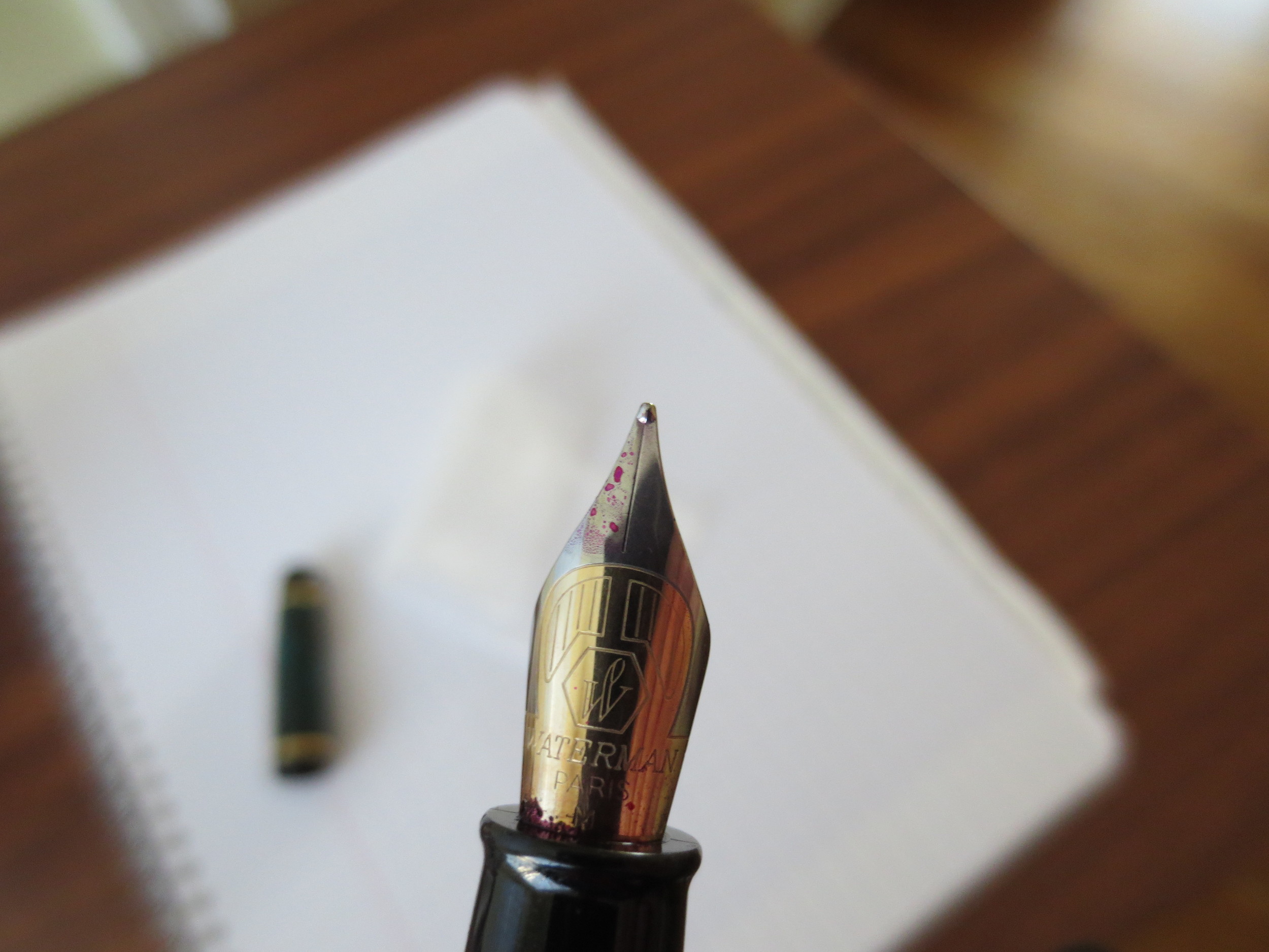
The Phileas Nib is a two-toned steel nib that writes well.  This one is a medium.  

The Phileas Nib is a two-toned steel nib that writes well.  This one is a medium.  

The nib is nothing remarkable, but it's a solid writer that does what it's asked to do:  write reliably.  It doesn't skip and I've never had a hard start.  I've been using this pen for the past week, filled with Iroshizuku Yama-Budo, and it's caused me no problems.  

The Phileas disassembled.  This one came with the Waterman threaded converter, which I like.  

A writing sample from the Phileas, using Edelstein Turmaline during my review of that ink.  Paper is Clairefontaine French-ruled. 

The Verdict.  This is a great pen that, in my opinion, never should have been discontinued.  For years, it was probably the go-to entry level pen out there.  If you can find one, it's still a great option for everyday use.  There has been much speculation as to why Waterman discontinued this pen (example link here), but IMHO the most plausible explanation is that Sanford, the parent company, wanted to take the Waterman line to a more upscale market position, at least here in the U.S, and therefore discontinued their "budget" line.  I was last in Europe a year ago, and I still saw some Phileas and Kultur pens on shelves.  Whether those pens were NOS or not, I couldn't say.  
A Modern Classic: The Parker Sonnet

One of the more underloved modern pens is the Parker Sonnet.  There are some good reasons for this.  Parker's quality control has been less than pristine in recent years, since their acquisition by Newell-Rubbermaid and moving production to France.  While I was writing this review, I glanced through the pen forums and many new Sonnet owners complain that their pens skip, or are hard starters after the pen's been sitting for more than a day or so.  I've experienced these problems intermittently and will discuss further below. 

That said, I love the look of this pen and couldn't resist, so when I saw a used Sterling Silver Cisele ("Chiseled") model at the DC Pen Show last year, priced well below what I would have paid for a new one, I jumped and walked it over to Mike Masuyama to tune before I ever used it.  For the most part, it's a good writer, with a springy 18k nib that I ended up landing for sub-$100, including nib work. 

Early model Parker Sonnet Cisele.  My research dates this pen to the early to mid-1990s, because of the two-toned cap band. 

The pen has a black plastic grip section.  It's sturdy, and doesn't become overly slick during long writing sessions. 

The Build.  This pen is hefty, given that it's sterling.  I'm not sure whether it's pure sterling silver or plated, but it looks nice and feels durable.  The cap is a slip-cap, which pops on and off securely.  There's no rattling involved.  The clip is still tight.  To me, this pen has near-perfect weight and balance, posted or unposted.  It sits in my hand well, which is why I find it keeps its place in my rotation despite the fact that it's the one pen in my collection that cannot handle a wide range of inks well (see below).

Posted, this pen is the perfect length and weight for me.

I can use this pen posted or unposted, but I prefer to use it posted.

There is nothing special about the pen's cartridge/converter filling system, but mine came with Parker's old style large-capacity converter, which holds almost 1ml of ink. 

The Nib.  The nib is 18k, which gives it some spring.  Sonnets do NOT have flexible nibs, as many understand that term.  I've heard second hand that more recent versions of this pen (mine likely dates from the early to mid 1990s) have stiffer nibs, with some describing them as nails.  Mine has just enough give in it to lend my writing a bit of flair, but the feed is nowhere near good enough to allow me to actually "flex" the pen.  

Parker's 18k Sonnet Nib is understated and generally an excellent writer, if a bit picky about what types of ink you use it with.

A basic writing sample in Aurora Black, probably my favorite ink to use in this pen.  There's no crazy flexing going on, especially in my day-to-day print-style.  However, under certain circumstances the softer nib can give your handwriting a touch of line variation.

Apparently a common problem with the Sonnet is that the nib skips, and can be a hard starter.  This likely has something to do with the feed not being able to maintain sufficient ink flow to the nib.  If I use a particularly dry ink, and write quickly, I will experience occasional railroading.  For example, well lubricated inks like Iroshizuku Kon-Peki, Aurora Black, or any of the Watermans work fine.  Inks with iron gall content such as Montblanc Midnight Blue (old IG formulation) or Pelikan Blue-Black make the pen temperamental. 

The Finish.  The reason I love this pen so much, and put up with its quirks, is the chiseled sterling silver finish, which is reminiscent of the old sterling silver Parker 75 in a larger pen.  As I mentioned earlier, my pen could use a good polishing to restore its shine, but it still looks great after 20+ years of heavy use.  The silver has developed a patina, which in my opinion adds to its character.  

The Verdict.  For all its quirks, I would still call the Sonnet a modern classic.  Parker has made this pen for nearly twenty-five years, and it has a loyal following, myself included.  If I were to purchase another, I would pick it up at a pen show where I could have a nibmeister tune the nib. For certain pens, this is well-worth a slight premium in price. 

Pen Review: Sailor Professional Gear Imperial Black Edition

One of my personal favorites, that until recently was always inked and used on a daily basis,  is the Sailor Professional Gear Imperial Black Edition.  Following a close call (and near total tragedy), my Imperial Black recently rejoined the rest of my collection thanks to Mr. Mike Masuyama, but more on that later.  

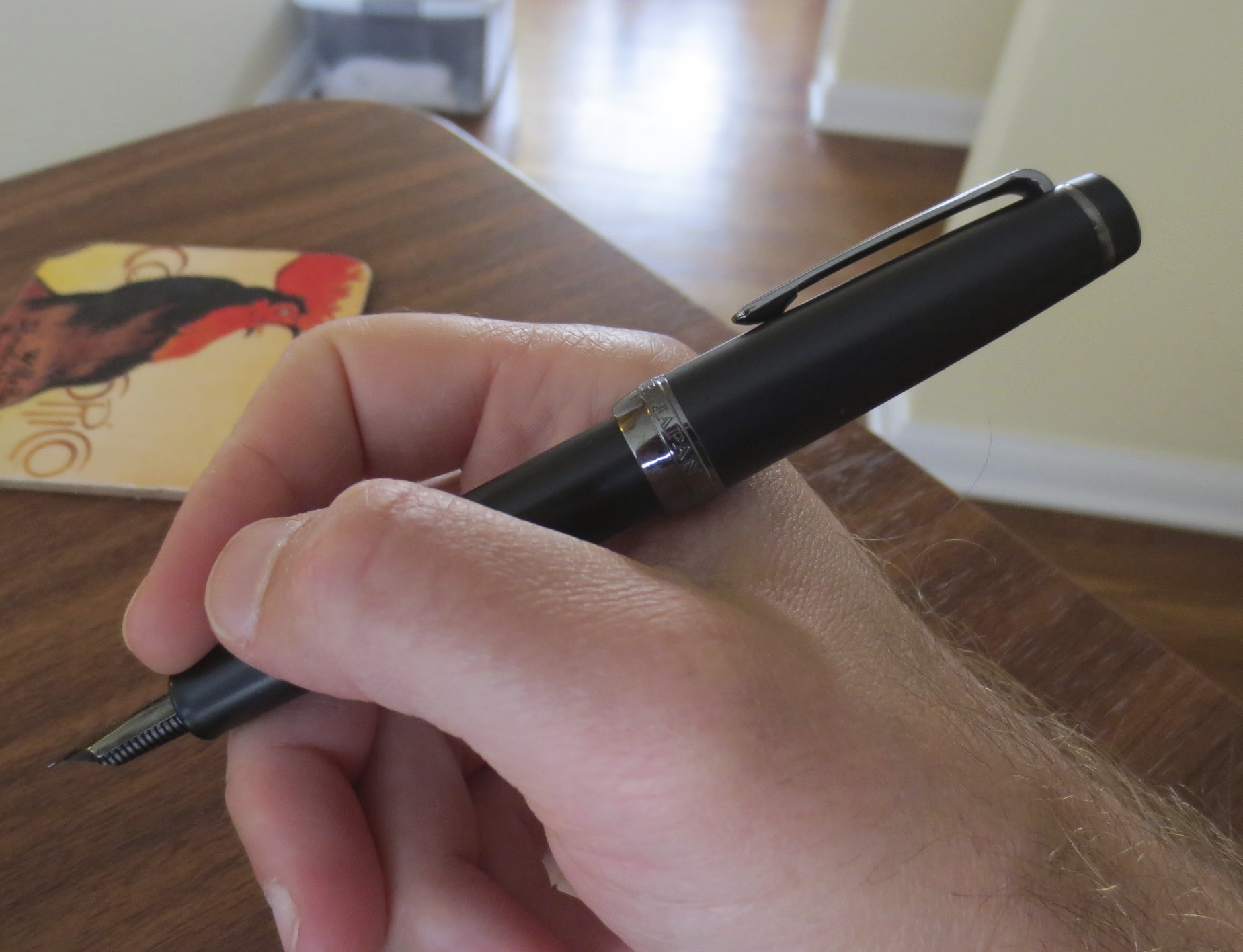
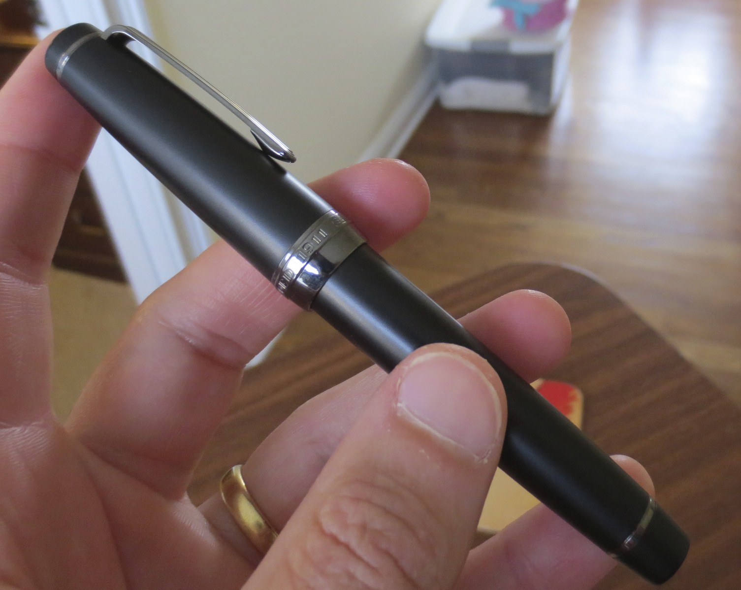
Aesthetically, this is one of the most beautiful pens that I own.  Sailor nailed it on the design.  I love the flat top cap and base, and the dark trim sets off the matte black color. 

I won this pen approximately a year ago in an eBay auction held by a Japanese eBay seller, and by sacrificing quick shipping and the U.S. display box option, I saved a little bit of money.  This pen has special meaning to me because I received it in the mail the day my daughter was born, and was carrying it and using it (with permanent Kiwa Guro pigmented ink, of course) to sign paperwork our entire first weekend with her.  Thus, you have my answer to that eternal question:  What pen would you use to sign your child's birth certificate?  (For me, it's not the Visionnaire.  I will give Morgan and his team credit, though.  They nailed the packaging on their product, as opposed to the hideous faux crushed velvet brown box in which this pen arrived.)  

If Elvis had purchased a pen in 1973 (which I'm sure he did), it probably would have come in a box like this. 

All joking aside, I knew from the eBay listing that this product was not coming to me in its original packaging (in order to save on shipping), so needless to say I wasn't expecting much in that regard.  This was my first Sailor pen, and what I was looking for here was one of Sailor's excellent nibs in a matte black pen with dark trim.  Apparently, Sailor uses Titanium ion plating to darken their trim, as opposed to Ruthenium.  Either way, I like the way this pen looks.  

Close-up of the titanium ionized trim.  My completely non-scientific survey of the pen industry revealed that Ruthenium is more commonly used in "stealth trim" than other metals, so Sailor's process may be unique?  Don't take my word for it--it's entirely speculation, and it doesn't really matter.  Both look great. 

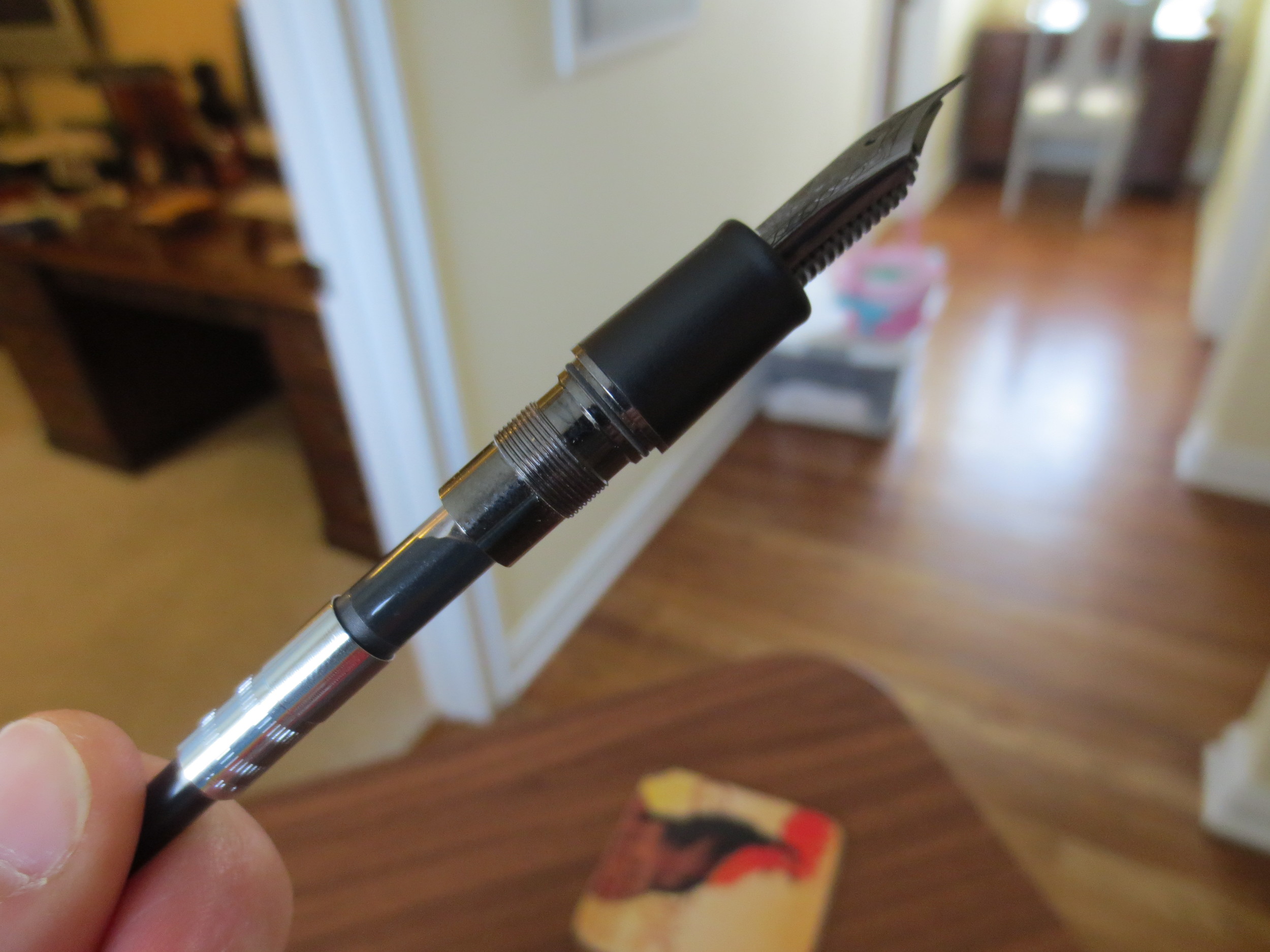
I opted for the fine nib, which is equivalent to a western extra fine or narrower.  Despite the fact that it is 21k gold, the nib is not "soft."  In fact, it's a fairly stiff nib that lays a very fine line.  For example, the Sailor "fine" lays down a line of ink approximately one-half the width of my Pelikan M600 with an extra fine nib.  This is perfect for my needs, since I spend the majority of time at my day job editing others' written work product and scrawling marginalia.

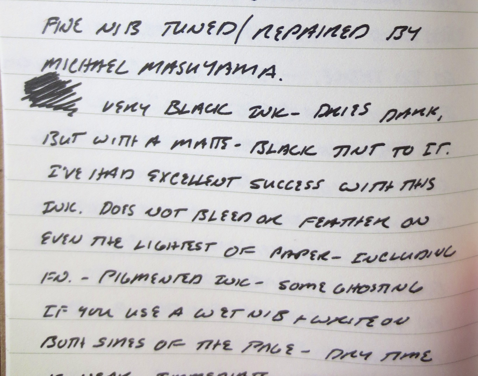
A writing sample is included below.  The ink used is Sailor's Kiwa Guro nano-black.  As you can see from the photos, I'm working up a review of that as well. 

Nib Close-Up.  The tip is so fine that I had a hard time getting my camera to focus on it.  My photography skills need work.  Anyway, take a look at the classy scrollwork on the nib.  Tastefully done, in my opinion, with Sailor's iconic anchor symbol.   

Close-up image of the writing:  Note the very tight lines.  Paper is Field Notes Shelterwood edition.

The Good

  • Sailor nibs are amazing.  Although I had the nib tweaked to perfection by Mike Masuyama (who I believe used to work for Sailor), the nib wrote extremely well out of the box and I used it for several months before having it slightly tuned at the D.C. Pen Show.

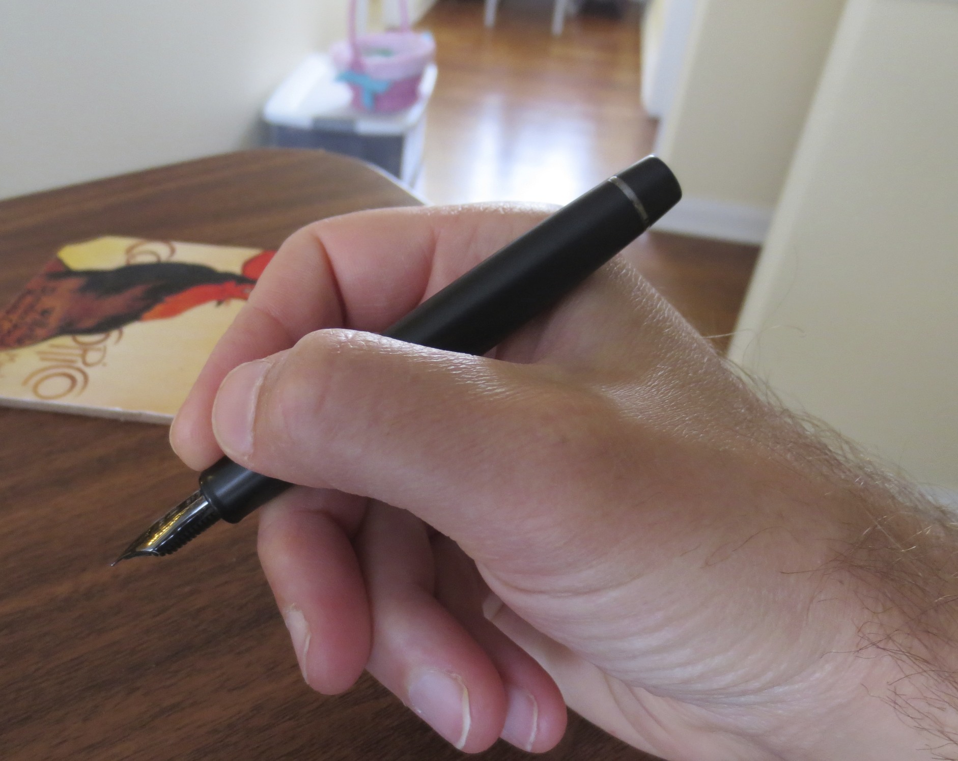
  • Weight:  The pen is very light and fits nicely in the hand.  You can use this pen for long writing sessions without your hand becoming tired. 

  • Looks:  I love Matte black "stealth" pens, even though they are on the verge of becoming played out with every pen company trying to bring out a stealth model. 

The Cons:

  • Weight:  The pen is very light and can fly out of your hand if it becomes sweaty.  As I alluded to above, this happened to me once, and a slight drop of four inches onto my desk bent the 21K nib nearly in half.  Regardless of how stiff the nib writes, 21K gold is a soft material, and bends easily.  I managed to straighten it somewhat myself, but I had to send it to Mike Masuyama to restore the ink flow to a proper level.  Of course, it's now as good as new, but I'm much more careful with this pen.  

  • Size:  If you don't post your pens, the Sailor Pro Gear model might be too small for you.  I have to post this pen in order for it to write comfortably, but I post nearly every pen I own and don't have a problem with doing so. 

  • Sailor pens take proprietary cartridges and a proprietary converter.  It is what it is. 

The Overall Verdict.  this is one of the best, if not the best, writing pens in my collection.  The nib is superb.  That the pen also looks great is a bonus.  It's hardly ever out of rotation, and even then it's only to make sure that other pens in my collection get regular use. There are multiple buying options for this pen, and as I mentioned in the review I purchased directly from a Japanese seller, since for whatever reason Sailor has elected to price this pen at nearly double the Japanese price in the U.S. market.

Pen Review: Kaweco Liliput

The Liliput is one of those pens that doesn't get as much attention as its slightly larger pocket pen brethren, the Kaweco Sport Series.  I understand why--the pen is very small, and is a "pocket pen" in the truest sense of the word.  While the Sport and the AL Sport both post in a way that makes them almost full size, the Liliput remains, well, liliputian.  This pen probably appeals to a smaller group of users than the rest of Kaweco's offerings:  those people who absolutely must carry a fountain pen with them everywhere they go.  

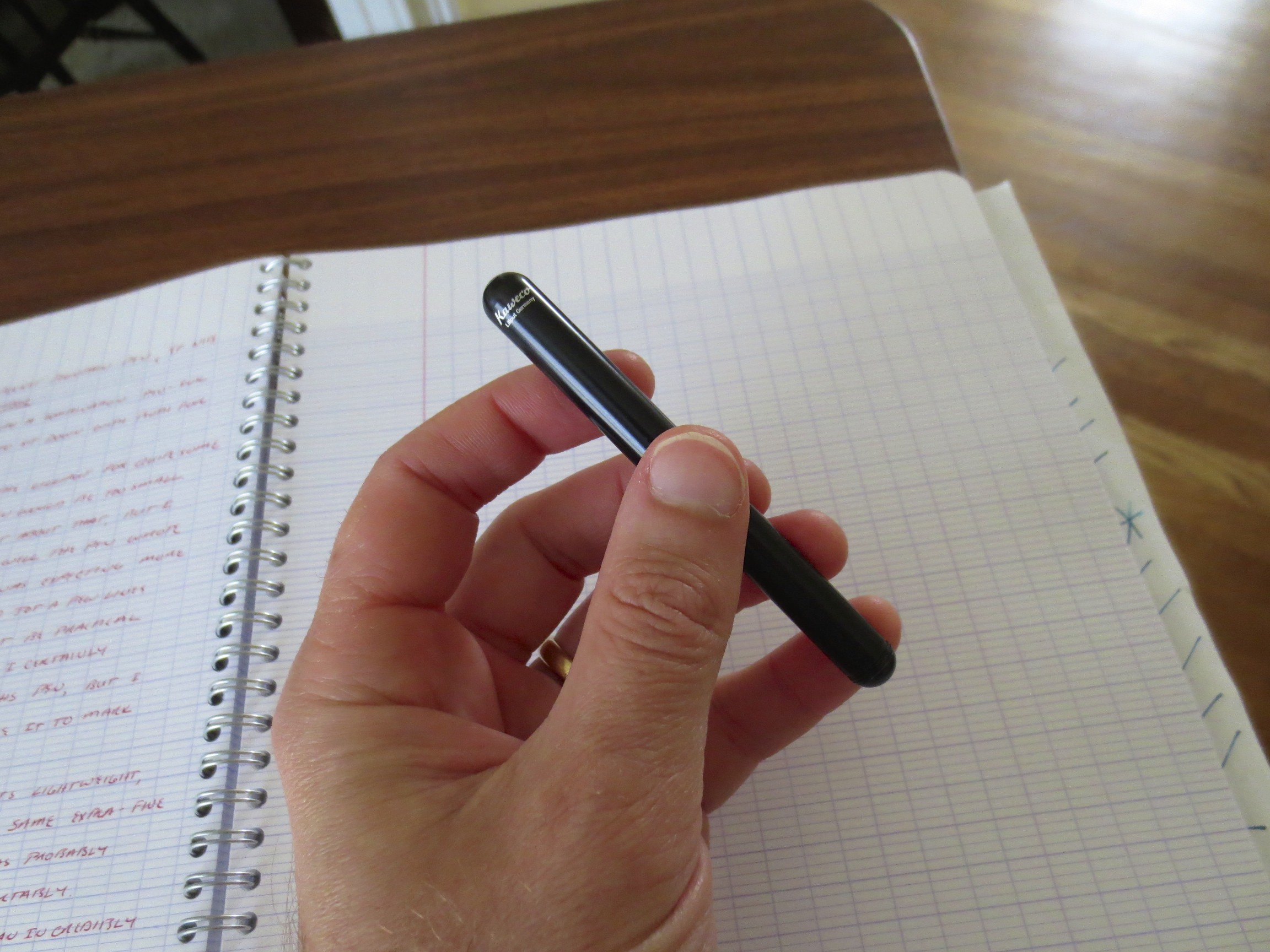
As you can see, the pen is small, but not so small as to render it unusable.  I like this pen a lot, and use it regularly as a pocket carry. 

The pen certainly is not so small as to render it unusable.  I use this pen a lot, particularly as a pocket carry when I'm out and about.  With the right ink, it's a good Field Notes/pocket notebook pen because it slides into your pocket easily and the EF nib that I have is not so wet that the ink bleeds through the page significantly.  I can still write on both sides.

Other reviewers have found the pen too light.  The version I have is the black aluminum version, and true, there isn't much weight to it.  BUT, Kaweco now offers a brass version available from Jetpens.com here in a new "Wave" styling.  Brad at the Pen Addict has reviewed this pen and likes it a lot.  (Link Here)  If you're concerned about the weight of the pen, and would like a pen with more heft, consider the brass version.

It goes without saying that this pen is cartridge-fill only.  The much-maligned Kaweco mini-converter might fit, but I would not recommend it.  Instead, pick up some cartridges of Kaweco's great ink, and refill those with a syringe.    

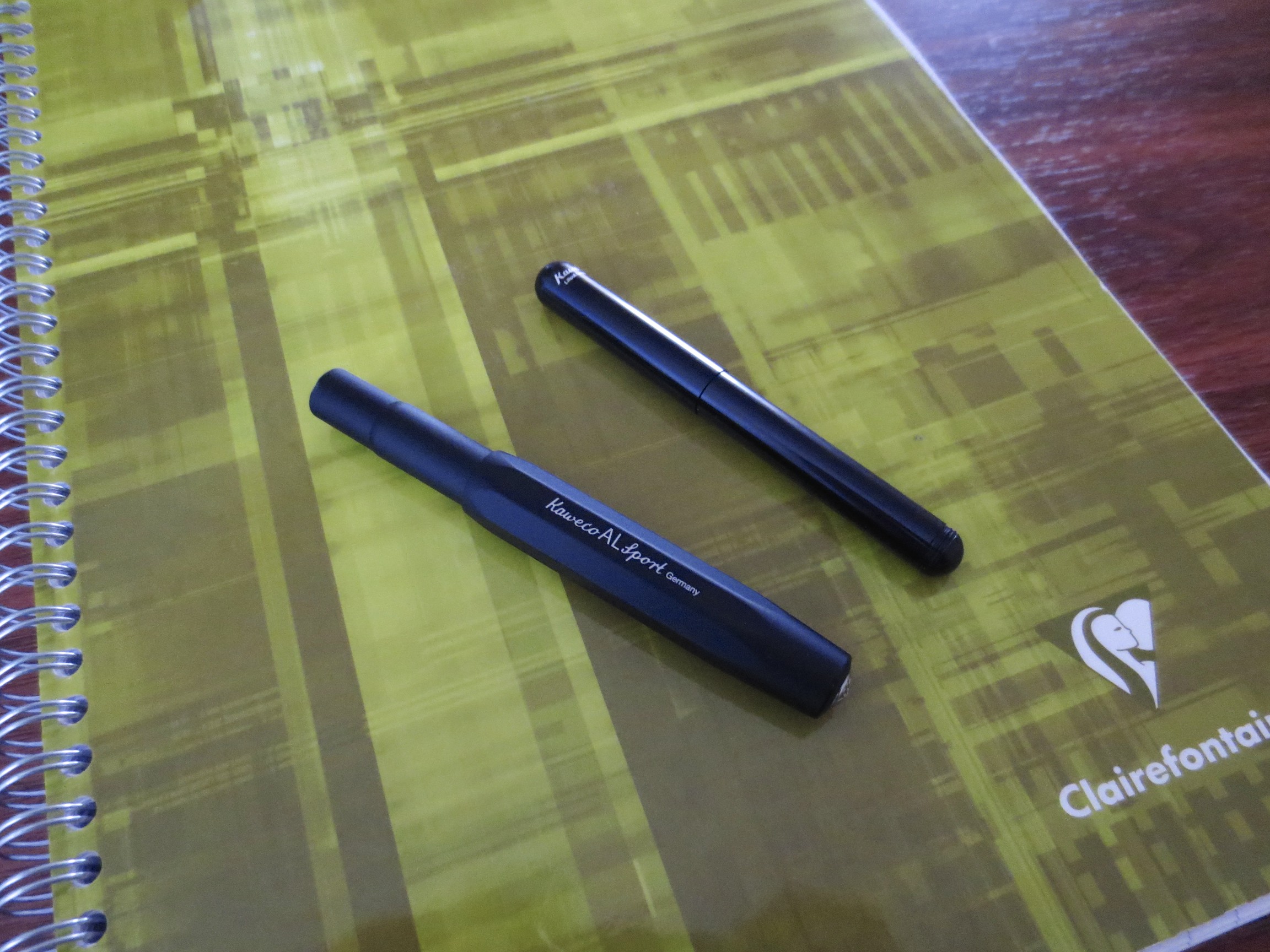
The Liliput is ultraportable.  See here compared to the Kaweco AL Sport.

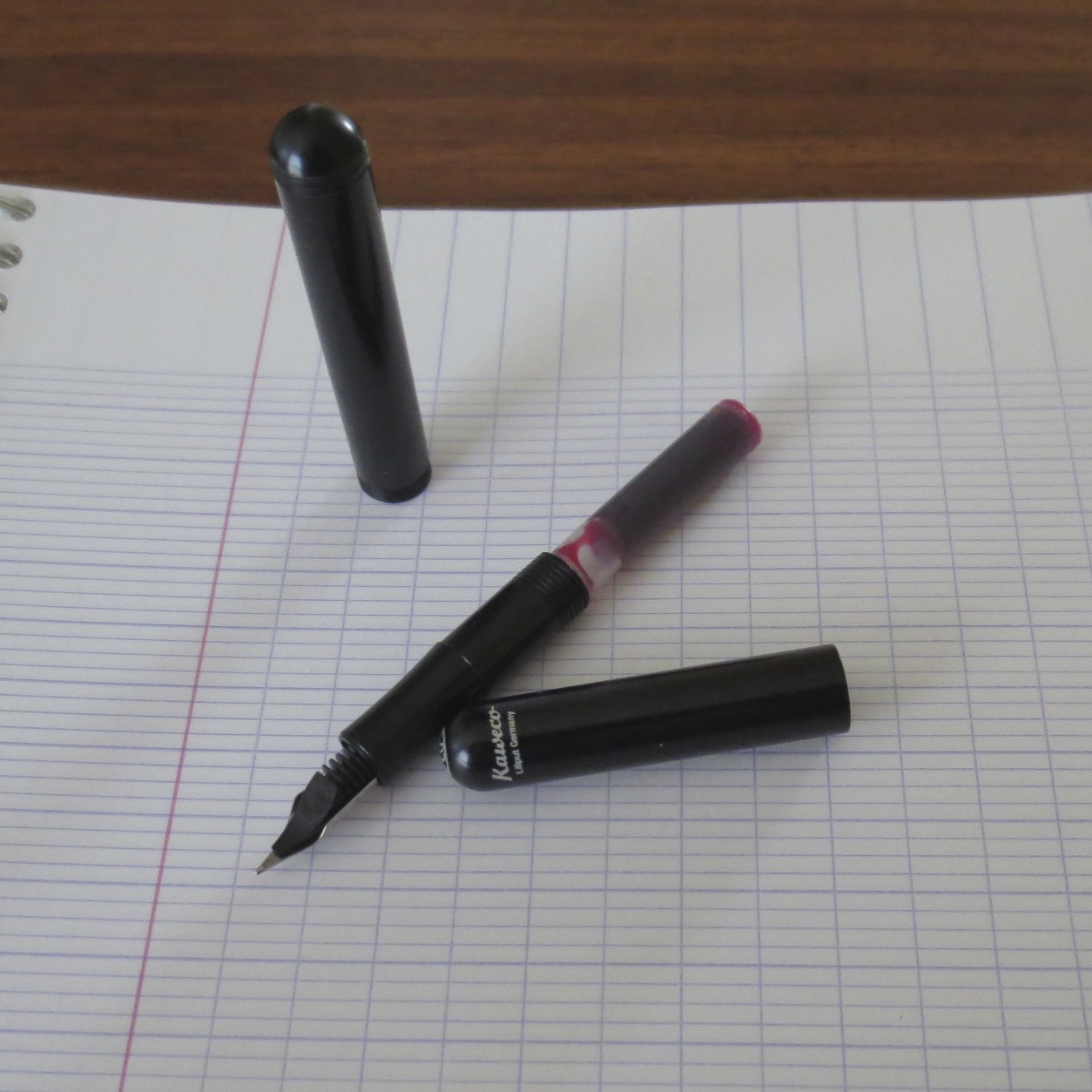
If I had to choose one "negative" to discuss, I would raise an issue with the nib that I chose.  The tines of my EF nib are cut unevenly, which you can see in the picture below.  This causes the pen to write with slightly more tooth than I would otherwise prefer and to dig into the paper if I catch a wrong angle.  I've not seen the same issue with the Kaweco Medium I own, or the fine or broad nibs that I've tried.  In the future on Kaweco pens, I would probably stick to the absolute basics (F,M,B).    

Overall, the verdict on this pen is positive.  For a pocket pen, It's a definite "recommend," but it's important to keep the "pocket pen" part in mind.  This pen was not designed to take 20 pages of longhand notes in a sitting or write a novel.  I'm glad to have it as part of my Kaweco collection.  

The nib slit looks unevenly cut on this pen.  I'll probably purchase a new nib eventually, and switch to the smoother writing fine or medium.  Kaweco nibs are interchangeable, at least for the Sport and Liliput models. 

Scan of handwritten review in Kaweco Ruby Red, and ink I've grown to love but a discussion of which is outside the scope of this review.

Scan of handwritten review in Kaweco Ruby Red, and ink I've grown to love but a discussion of which is outside the scope of this review.

PUBLIC SERVICE ANNOUNCEMENT:  To all of those who participated in my giveaway last week, check the comments of that post to see if you've won!  I've only heard from two of my four winners and if I don't hear from the other two by Sunday I'm going to have to pick two new ones. 

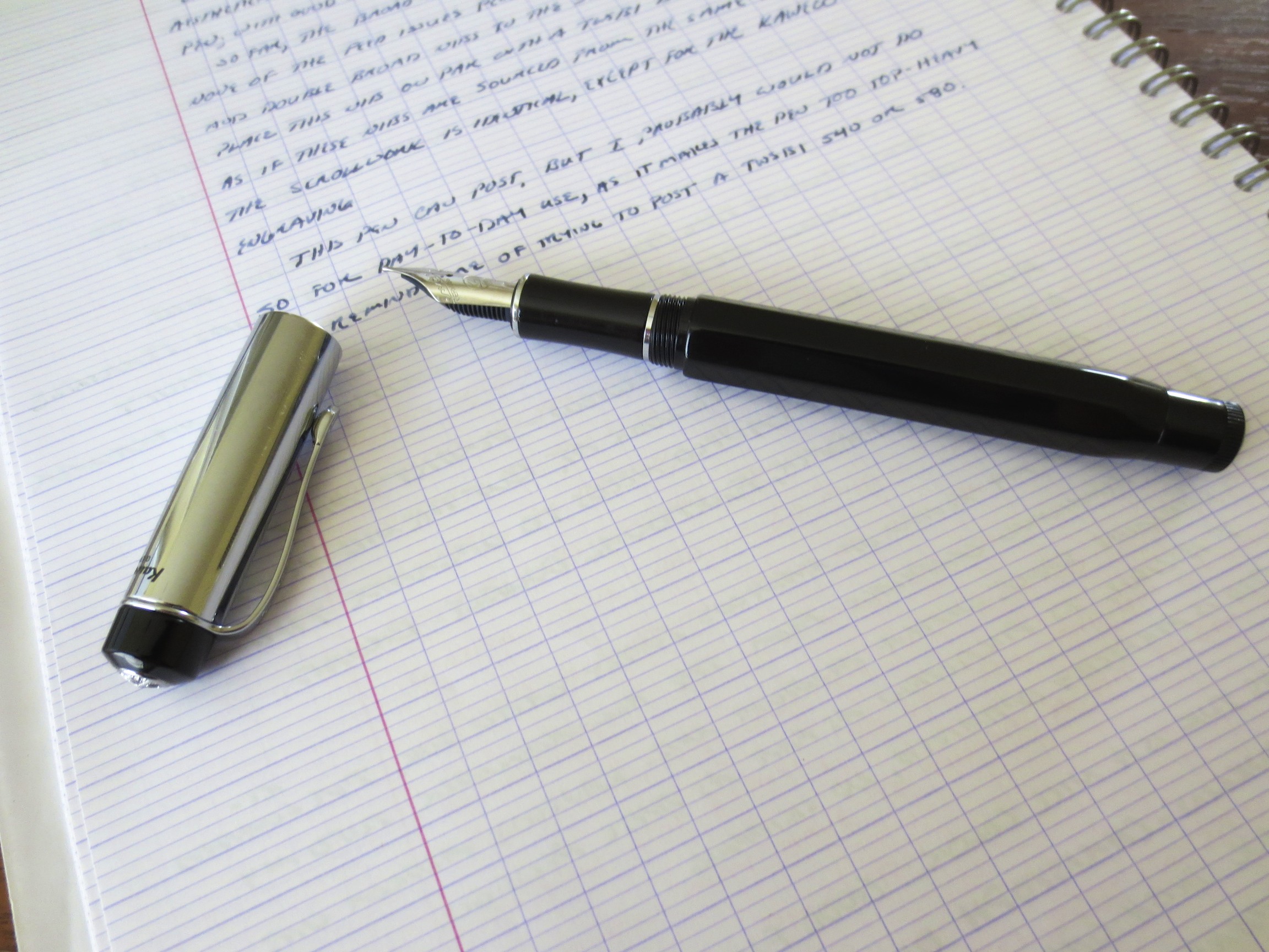
Pen Review: Kaweco Elite

The second of two Kaweco pens loaned to me for review purposes is this Kaweco Elite, with a broad nib.  This review will be brief because I can be short and to-the-point on this one:  there's nothing wrong with this pen, but it's not for me, and certainly not at the $150+ price point where Kaweco has it listed. 

This is a nice-looking pen, albeit a bit clunky when posted.  It's a multifaceted resin body, with a metal/chrome cap.

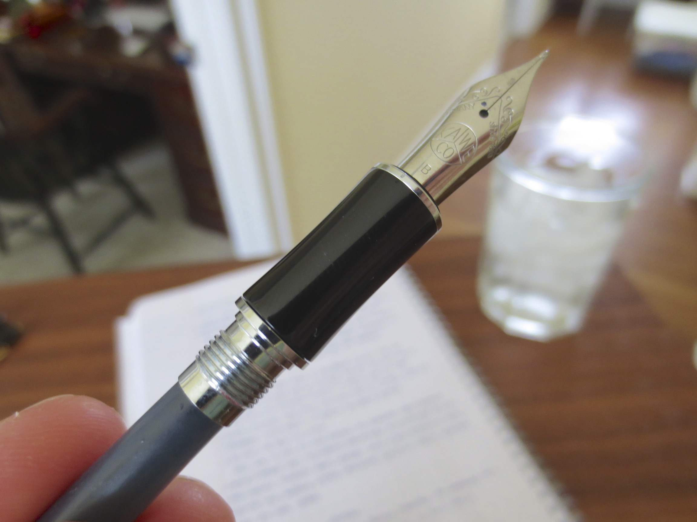
The broad nib is much larger than the nib on the more common "sport" line of pens.  In fact, it looks nearly identical to the nib on the TWSBI 580, and writes very similarly as well.  I believe the TWSBI nibs are made by Bock or Jowo, two of the major German nib manufacturers, so it very well could be the same nib.   

A nice, high quality, stainless steel German broad nib.

This pen is very heavy due to the metal cap, and as a result was difficult for me to use posted.  I found no major flaws on either the body or the cap--it's a very nicely made pen.  I don't understand, however, where Kaweco thinks this pen fits in today's market.  This is a cartridge-converter steel-nibbed plastic/metal pen priced at $150, while TWSBI is currently selling a piston-filler that uses the same (or similar) nib for $55.  No matter how good a writer this pen is, that's a considerable delta on the price, and I'm not sure what the consumer is getting for that additional $95. 

In fairness to Kaweco, I only used this pen for the morning before I had to return it, so it's possible it would have grown on me.  I suspect, though, that the Elite is simply not a pen for me, and I'll continue to hold out until I get to try my Dia2 or an Allrounder with a larger nib.

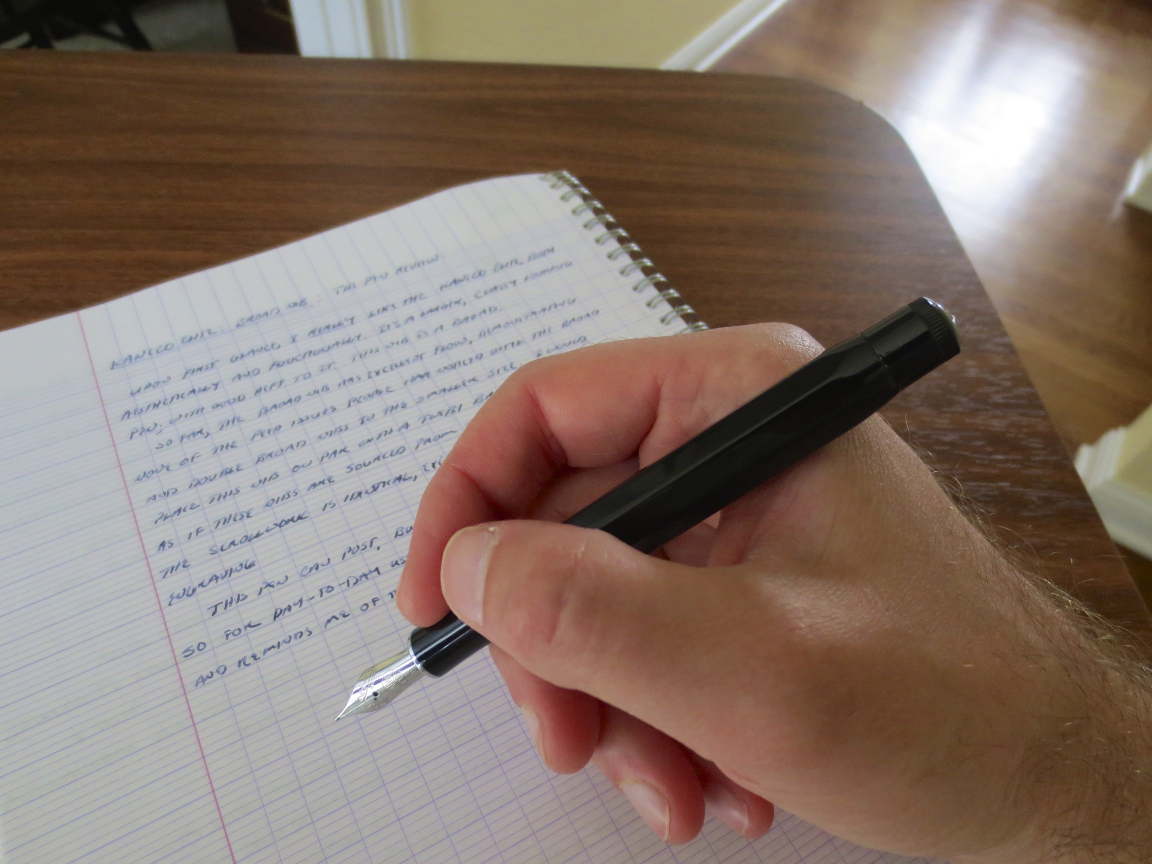
Handwritten review of Kaweco Elite fountain pen.  You may recognize the mini-review of the Kaweco Blue-Black Ink at the bottom.